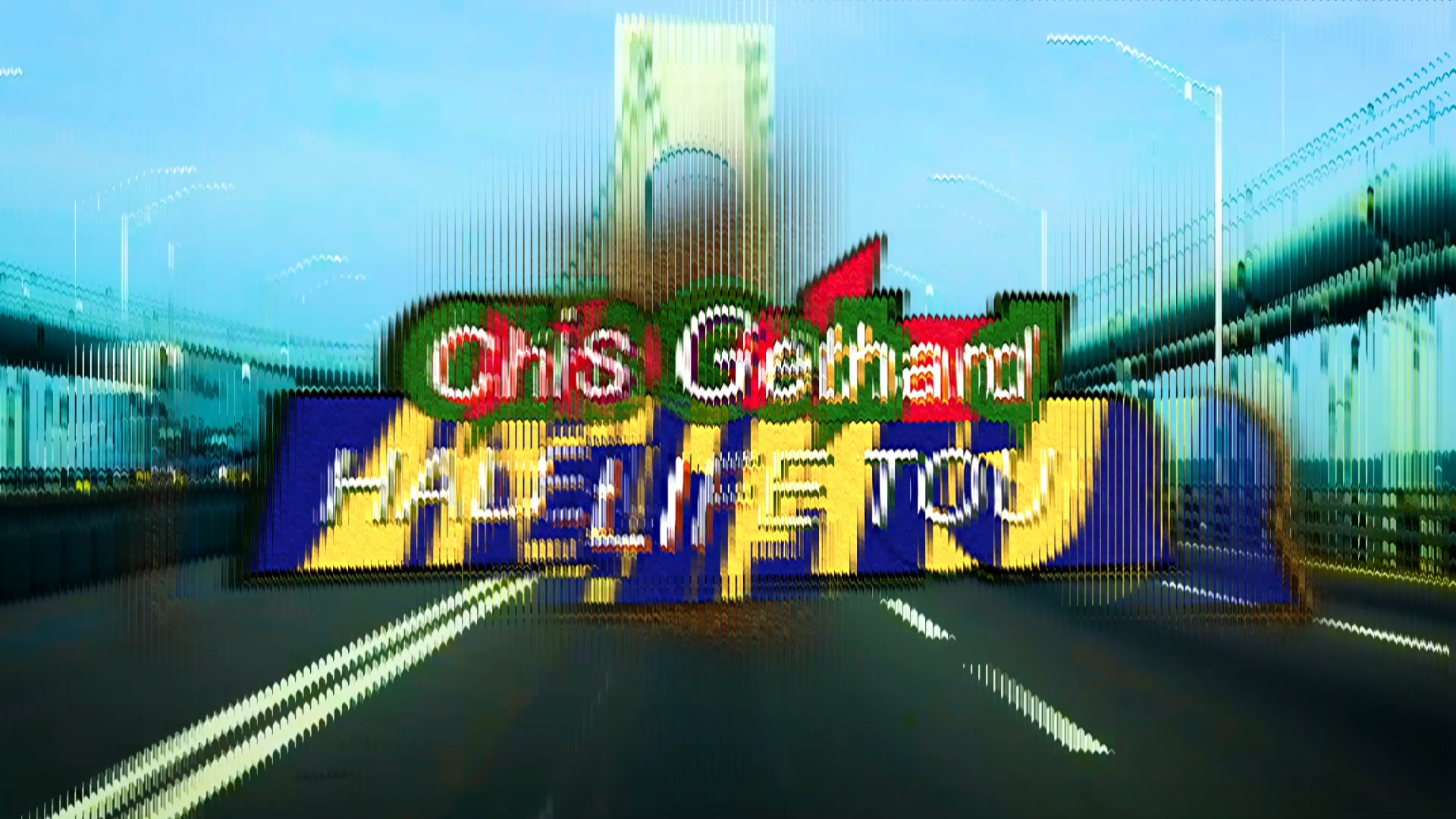
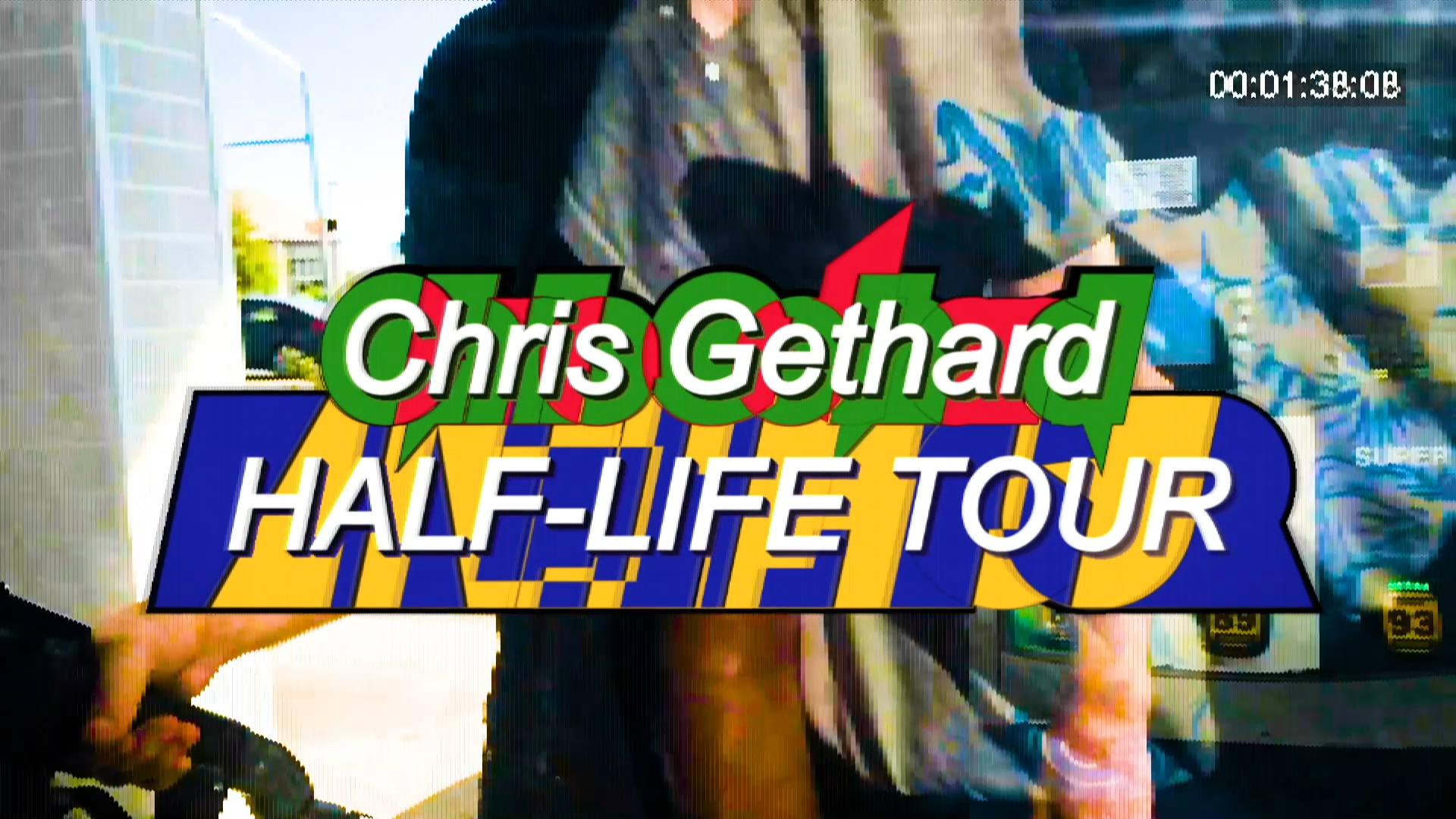
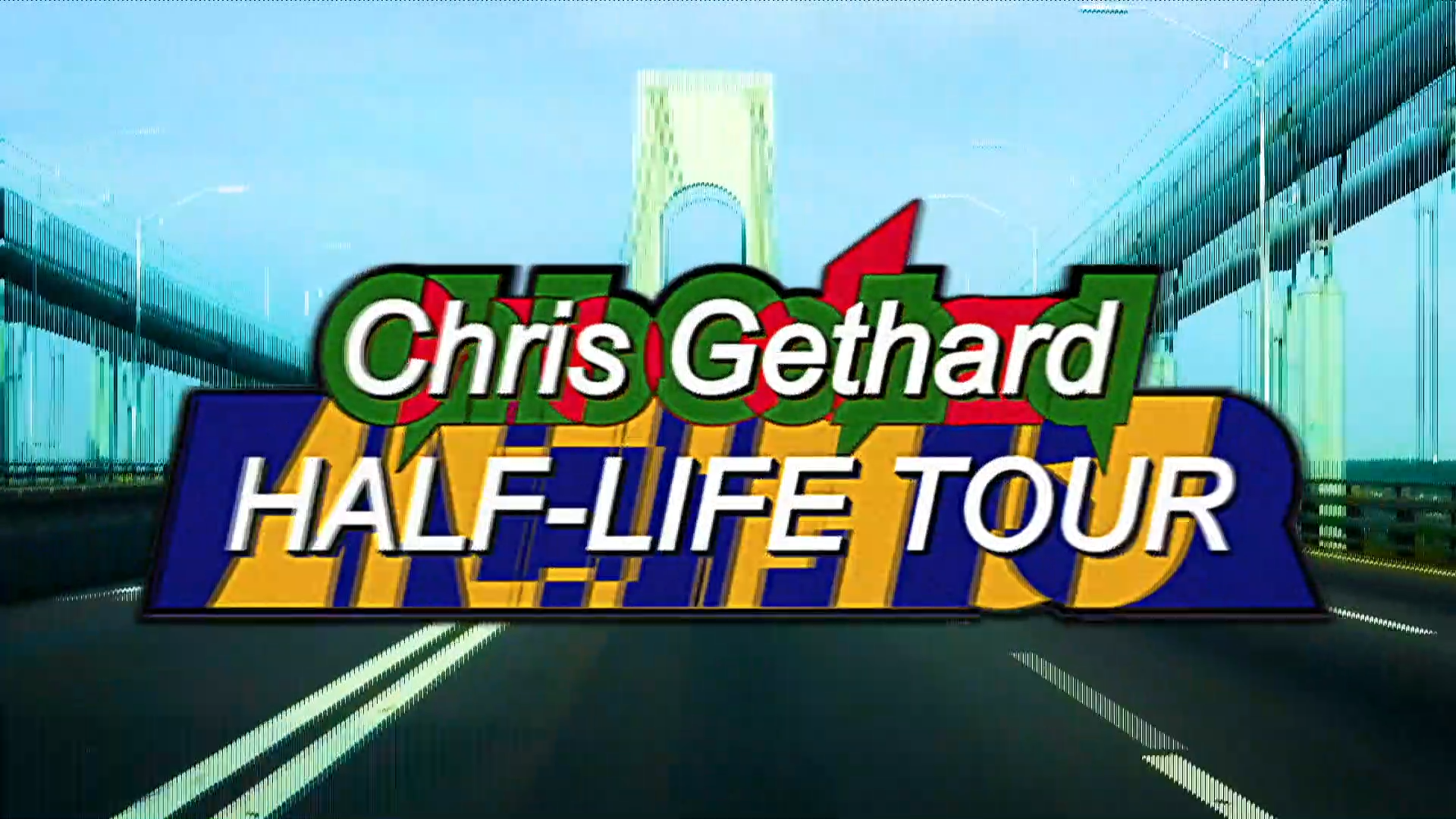
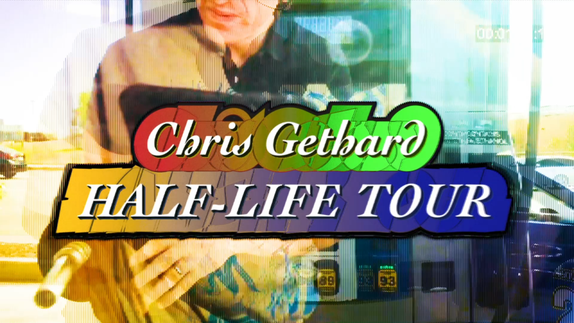
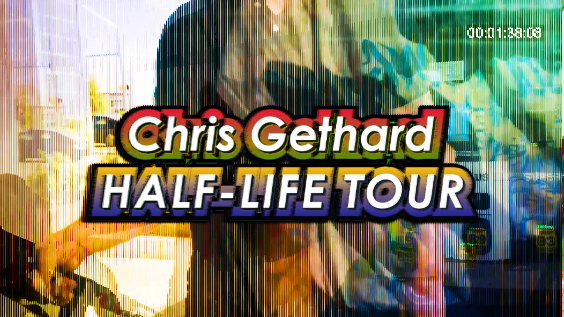
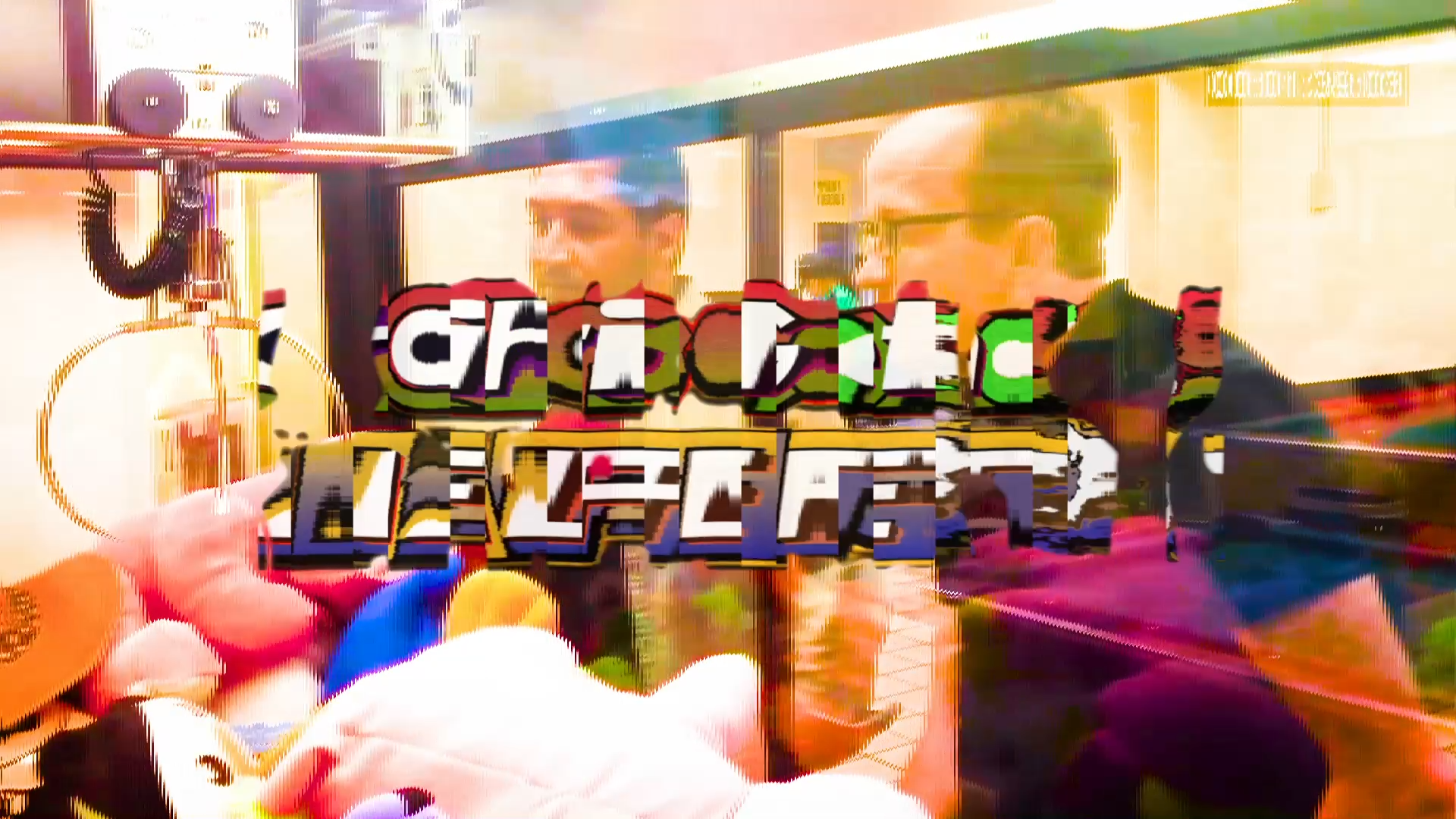
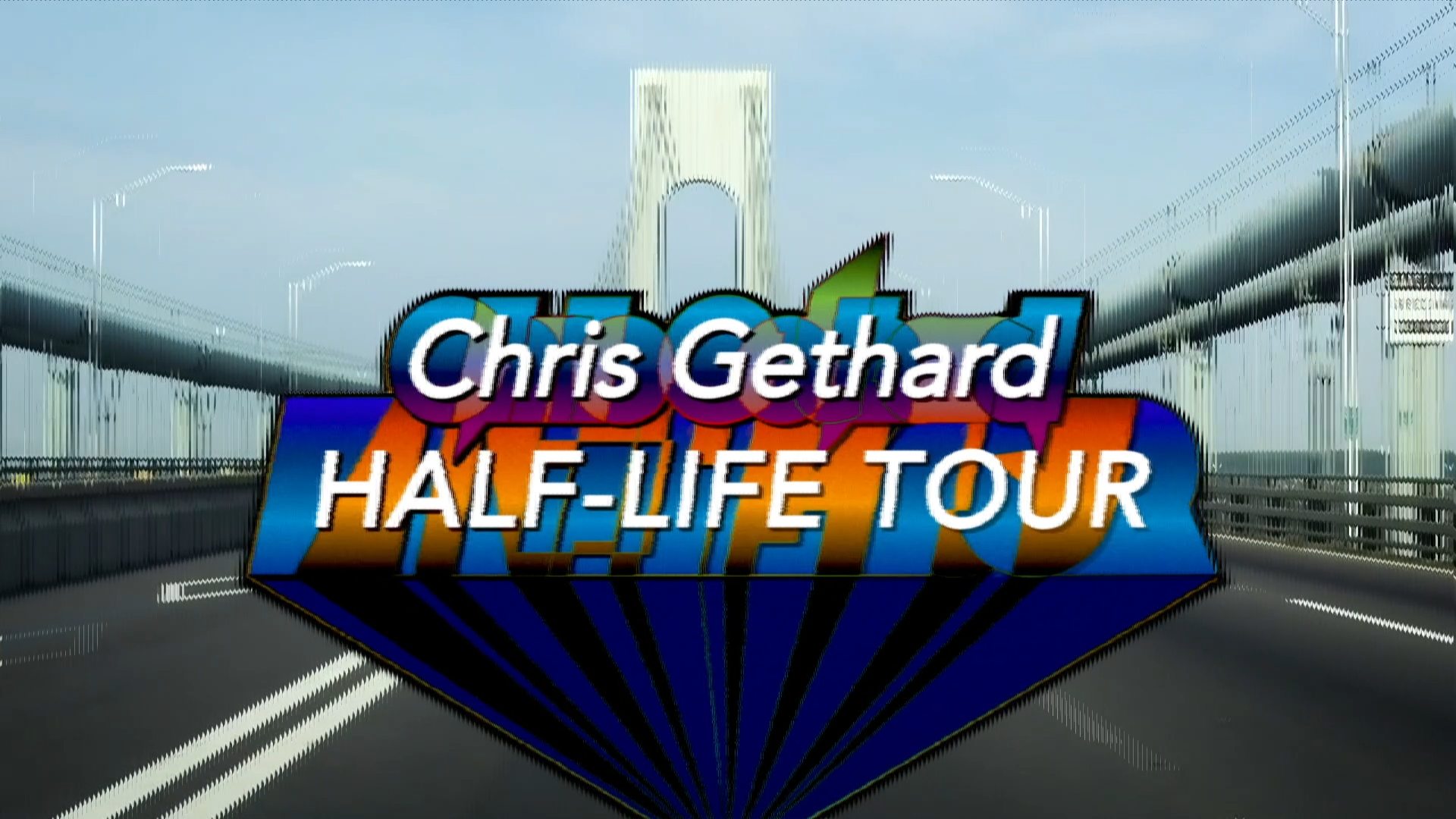
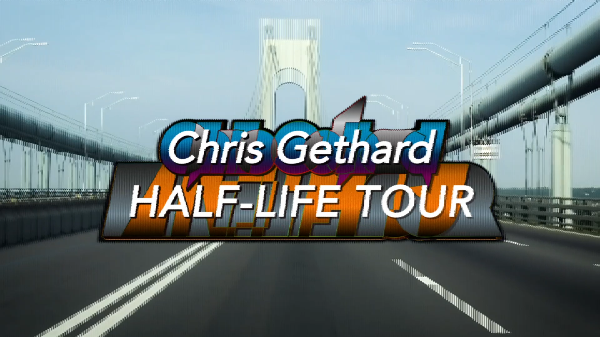
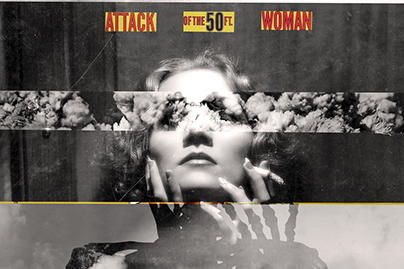
Poster by someone else! Title text by me.
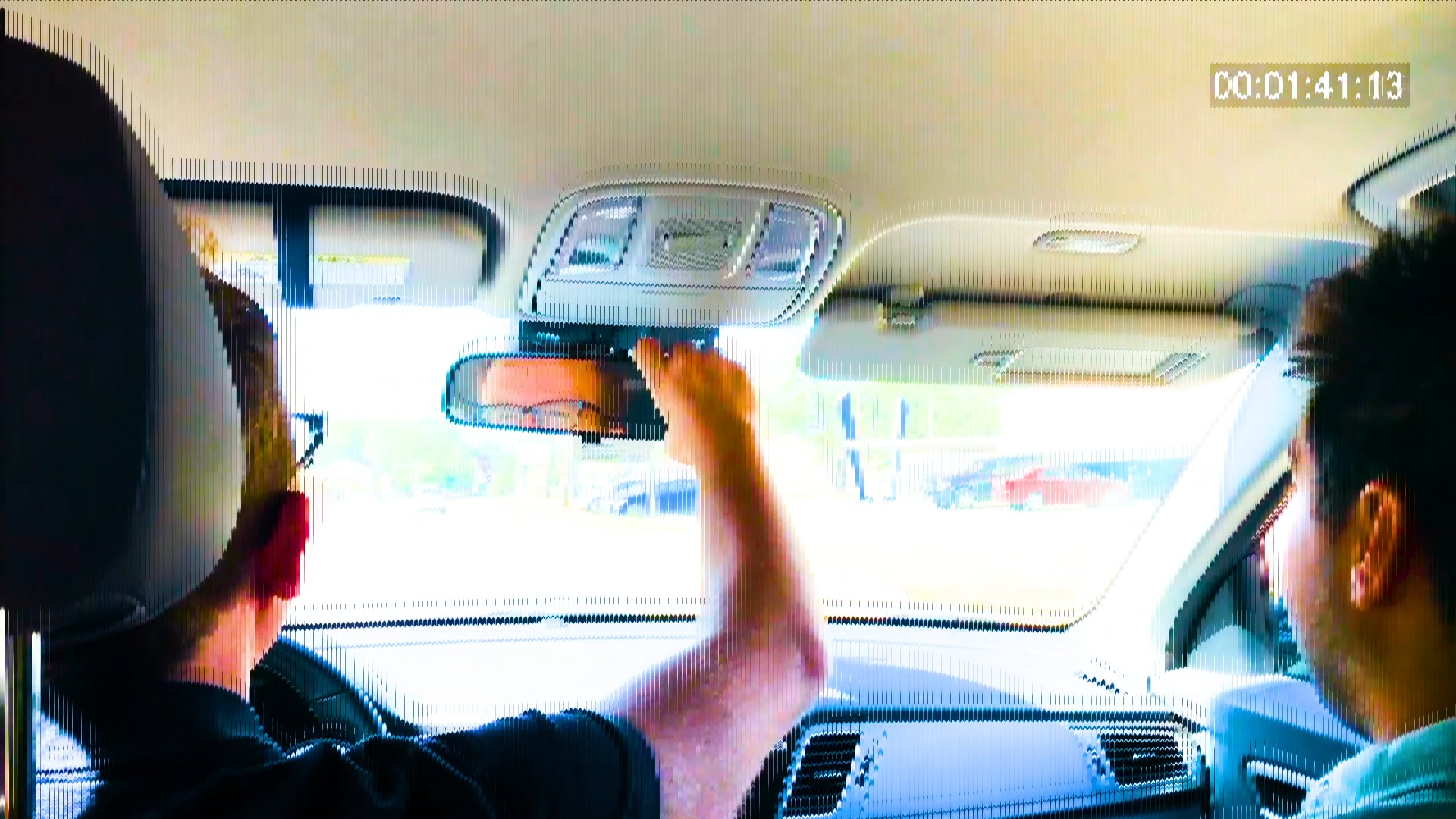
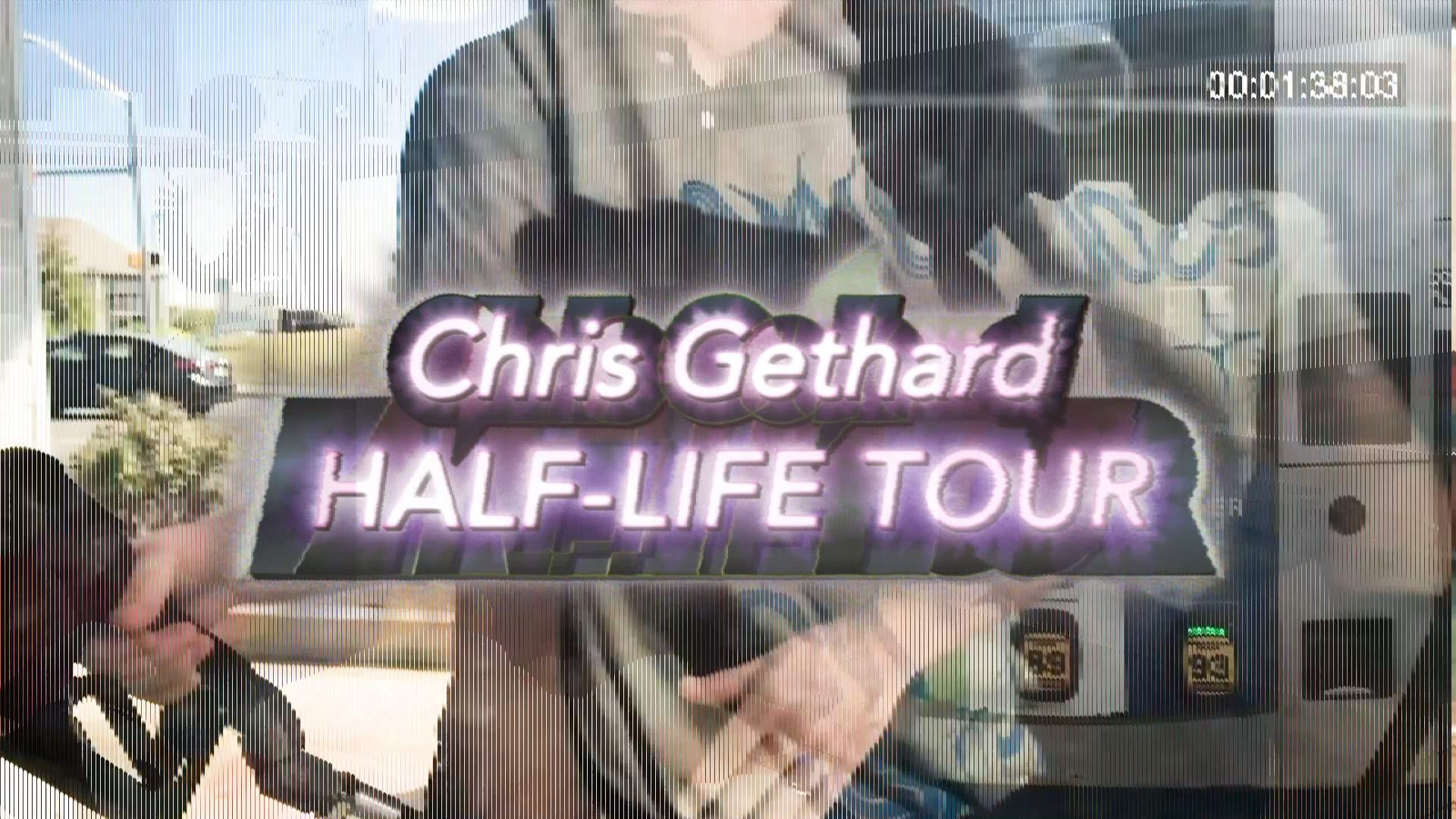
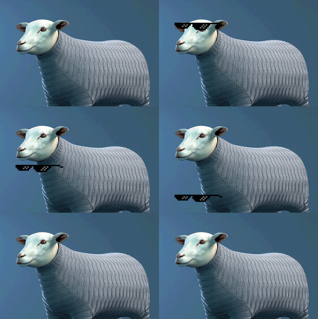
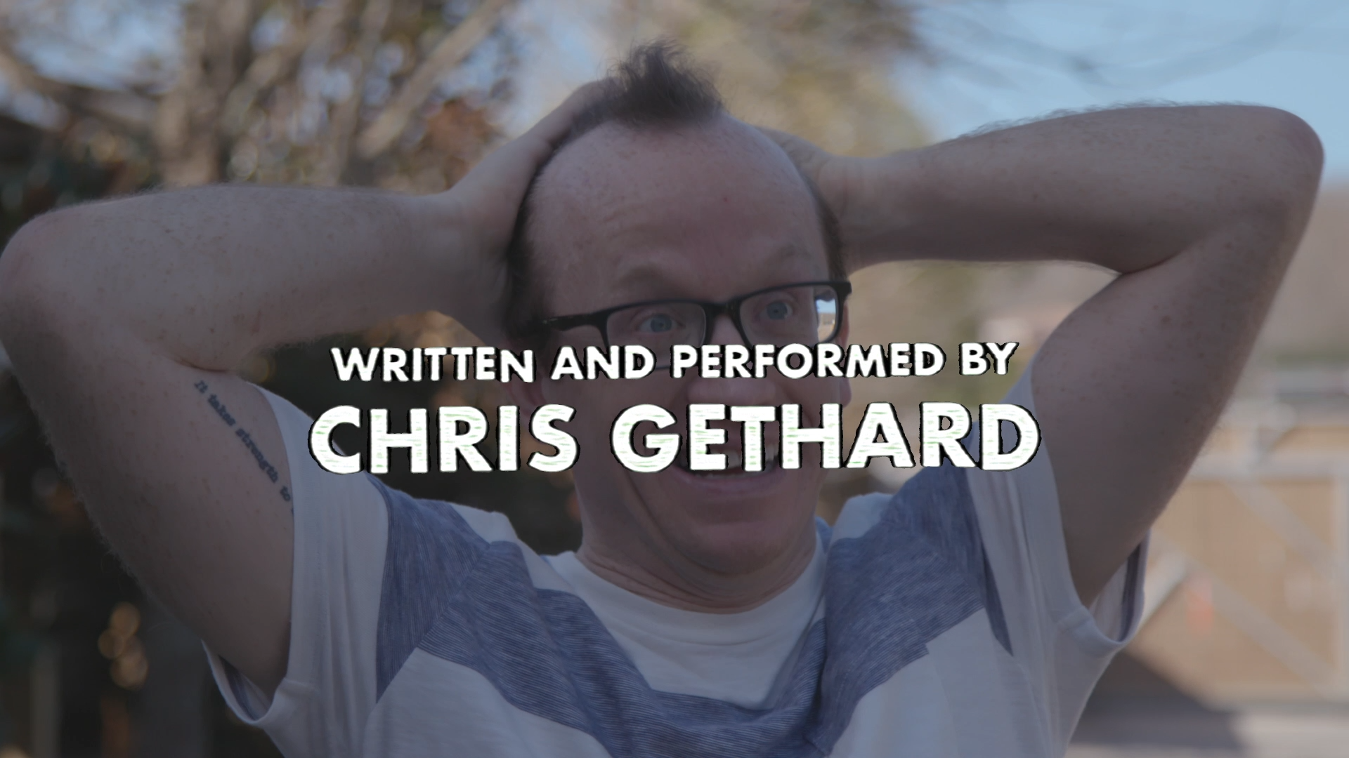
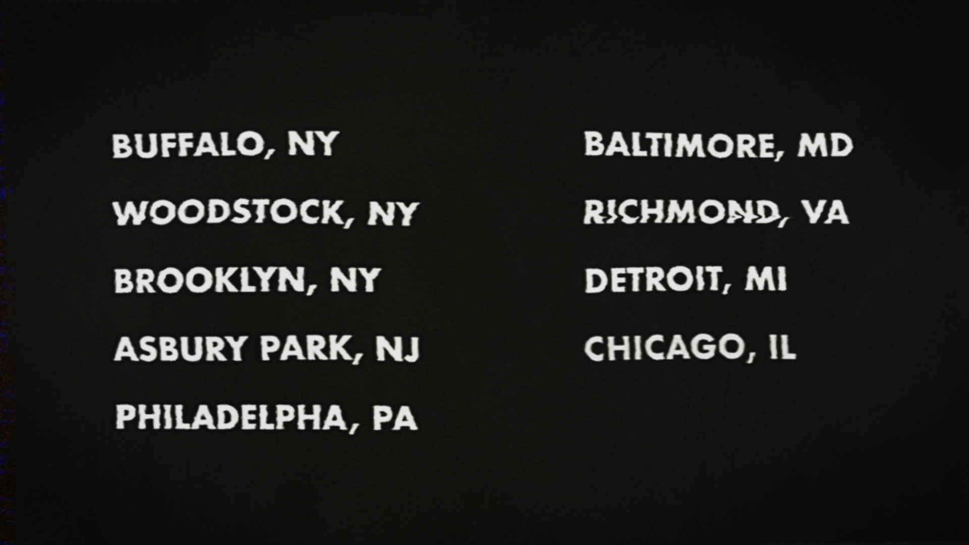
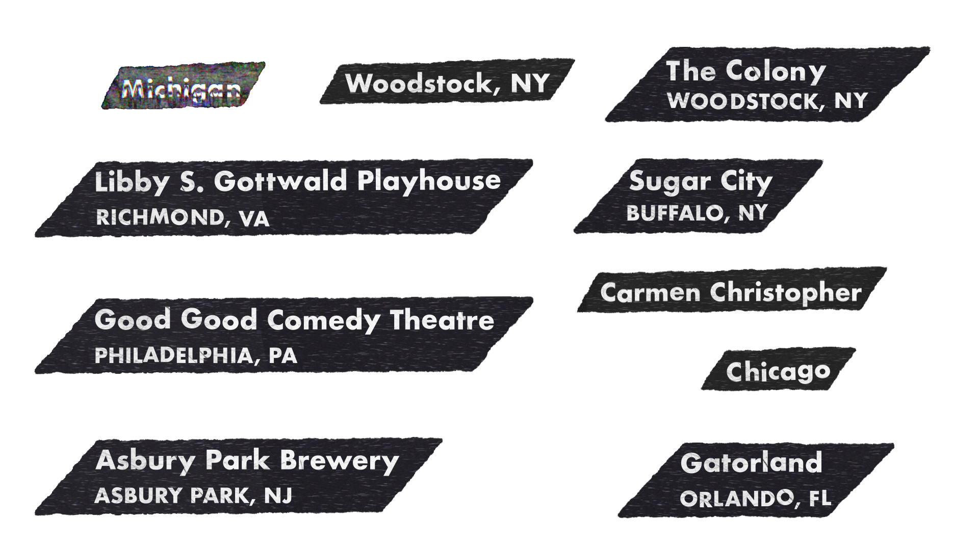
In 2020 I created motion graphics for the comedy special Half My Life by Chris Gethard, directed by Kate Sweeney. Here's a little bit about them! The motion graphics evoke the standard players of the DIY aesthetic in the 2000's: VHS tape, MiniDV, copy & paste posters printed on copy machines, grit and grime, wiggly and warped blocky type.
There weren't that many different kinds of motion graphics to create, but there were over 50 titles to create in relatively short order. I used Adobe After Effects' Essential Graphics panel to create a scalable system for pumping out motion graphics based on notes from the director. I used expressions to program random wiggles, warping, and grime so that each title still felt unique.
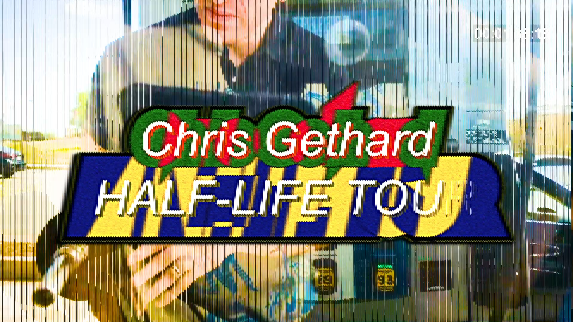
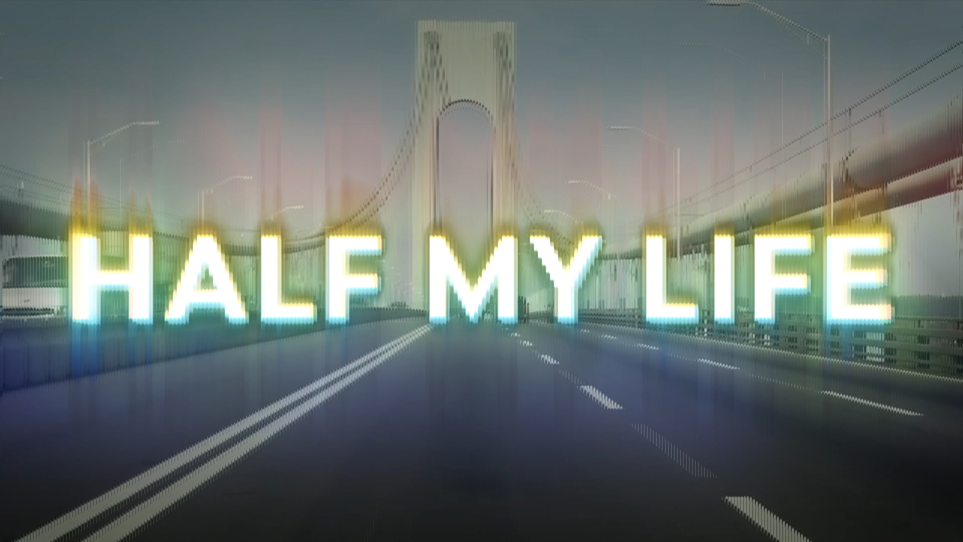
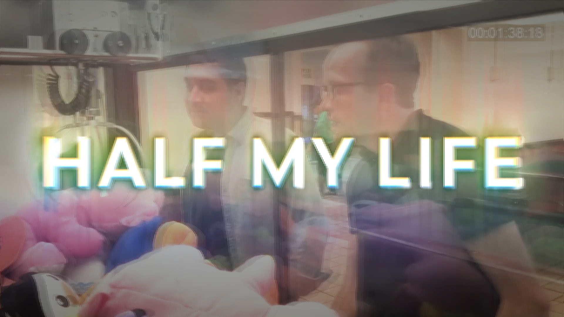
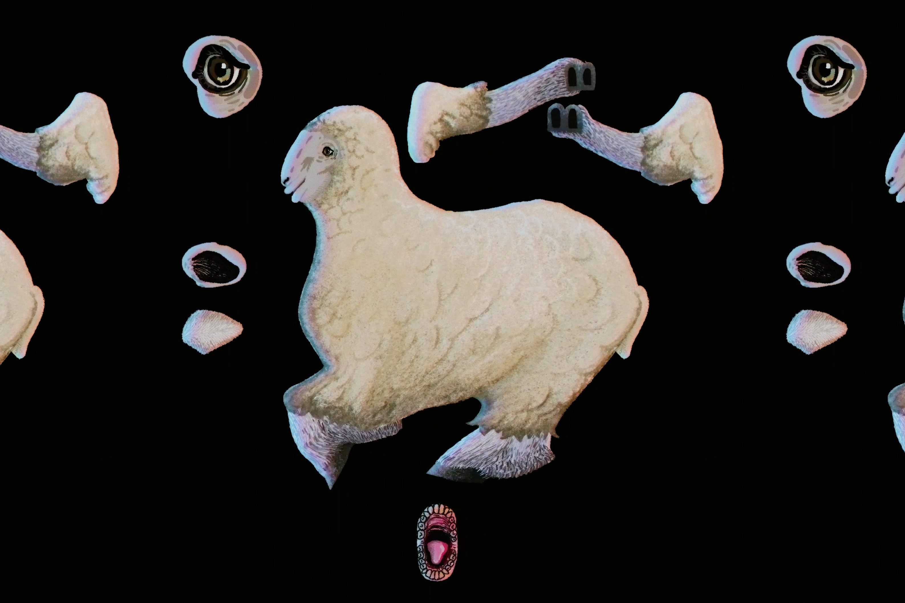
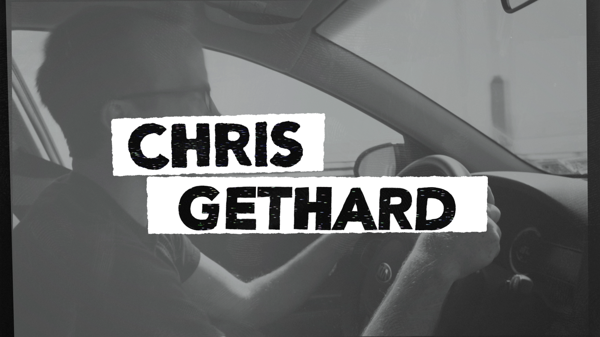
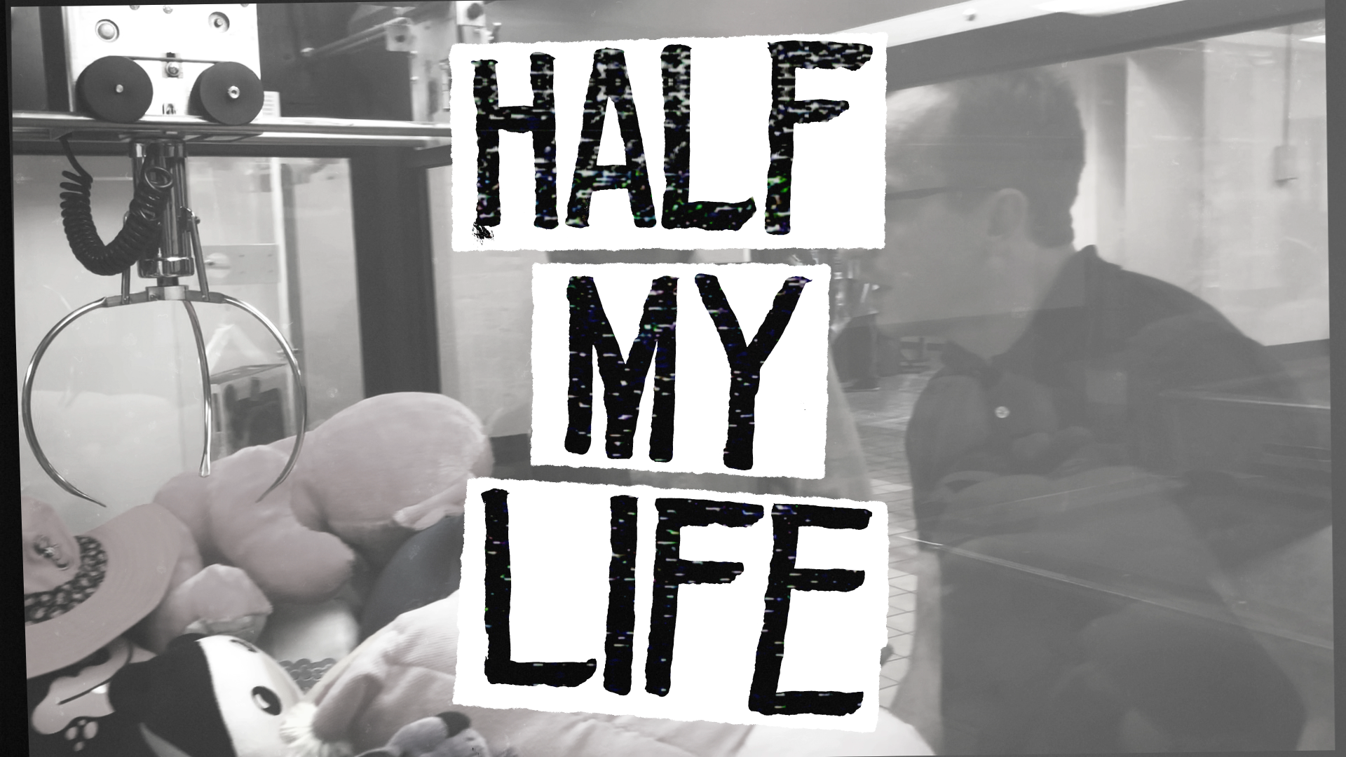
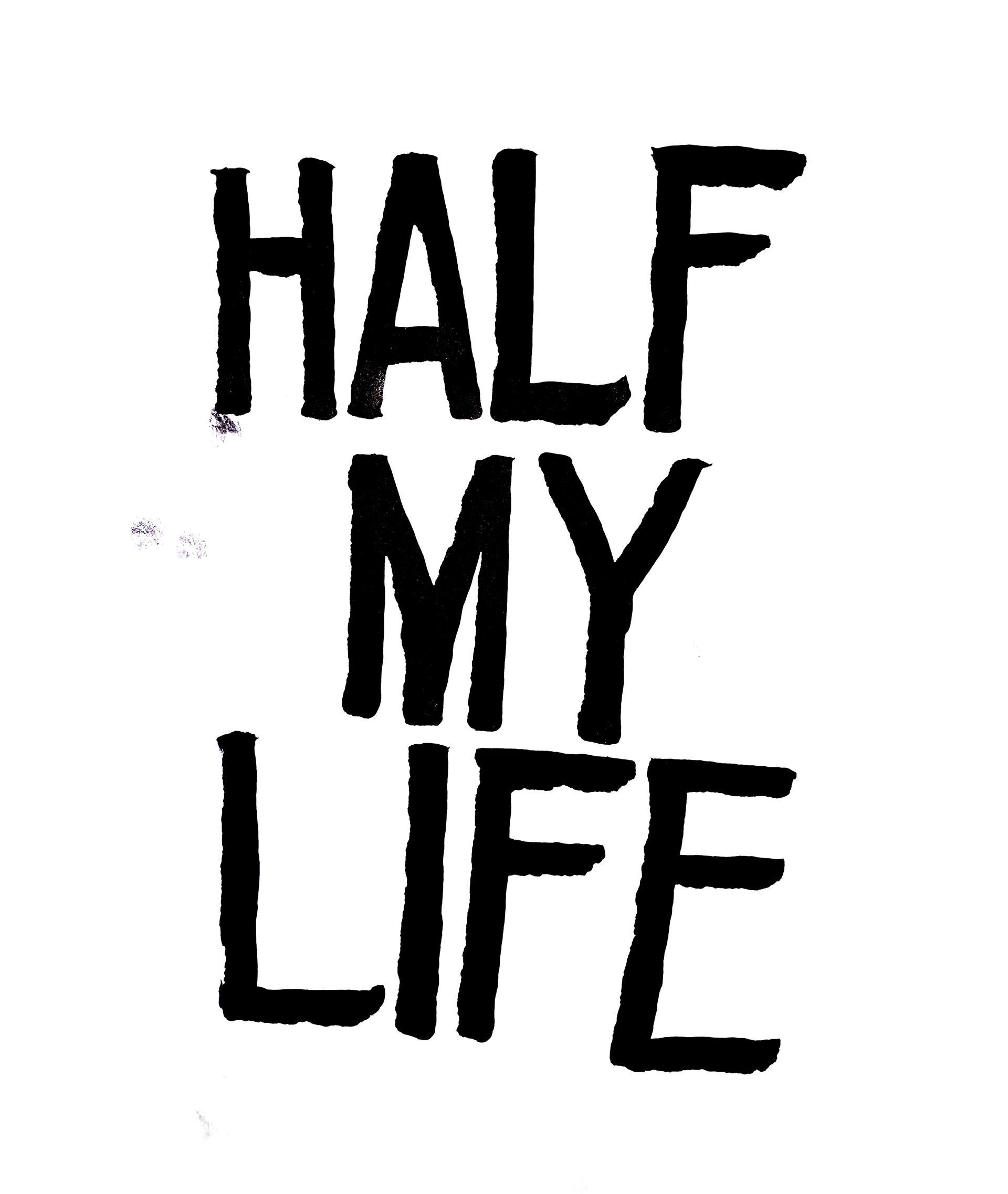
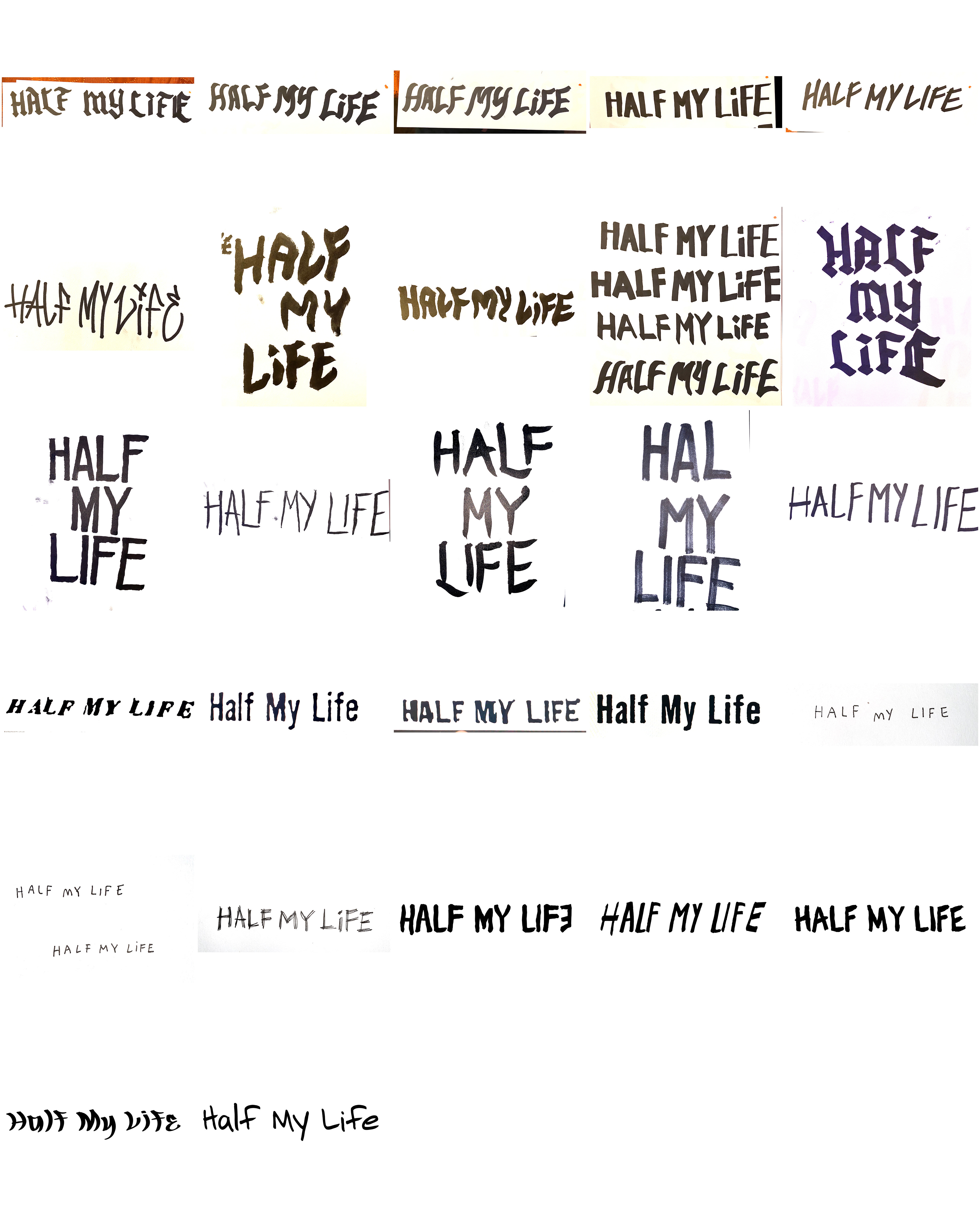
The main title was created with an already-edited montage and music to provide some cues for me. I used the concept of the analog copy & paste poster to motivate the motion. The words "Chris" "Gethard" "Half" "My" and "Life" fly onto screen like pieces of cut out text on a scanning bed, while the montage background rotates and jitters at a low frame rate, like they are all printed out pieces of construction paper at the copy store forming a kind of flipbook animation. I wrote the title myself using a big Sharpie to sell the DIY look.
You can watch some of the graphics in motion below, and see some of my rejected concepts at the bottom of the page.
Unsuccessful Explorations
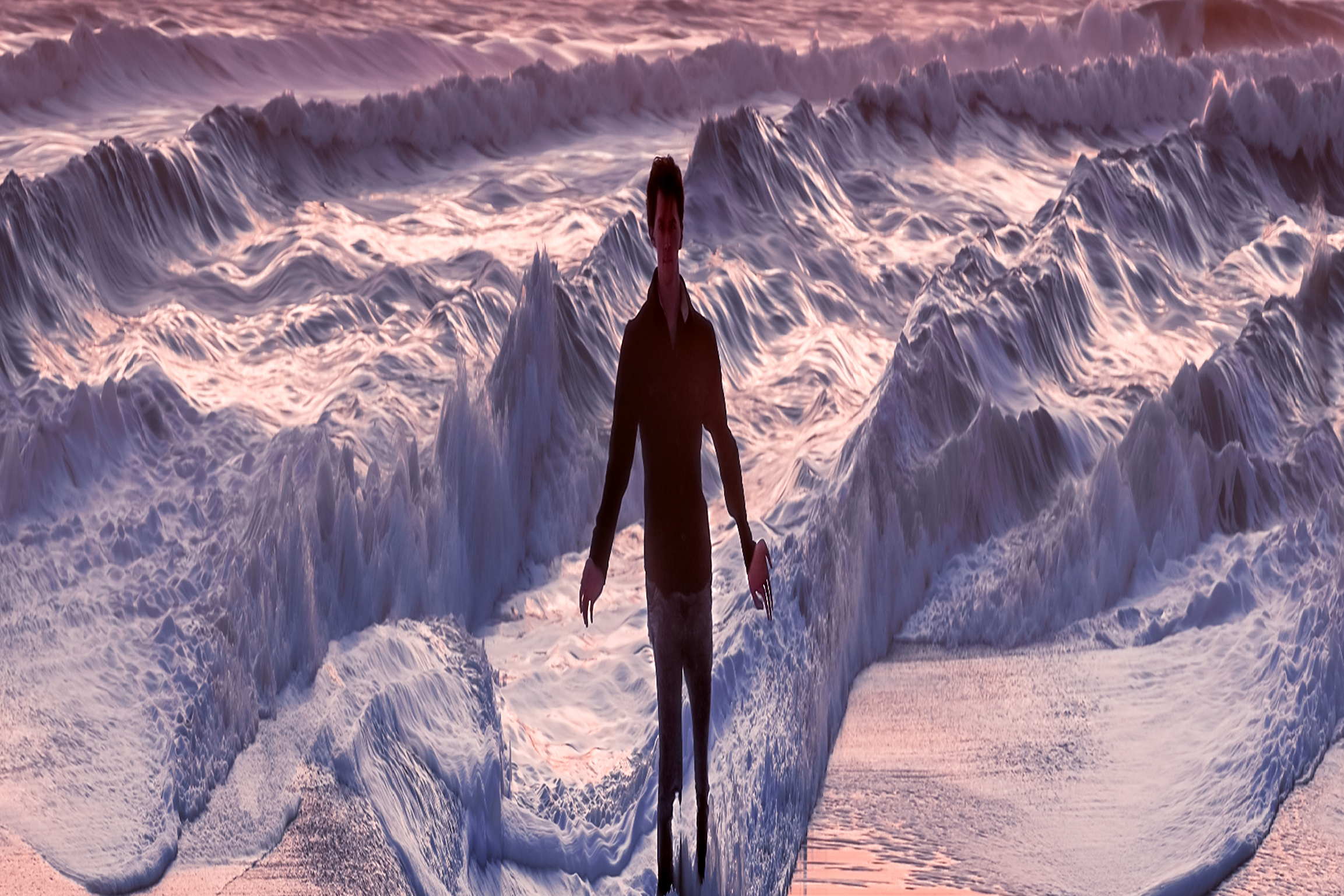
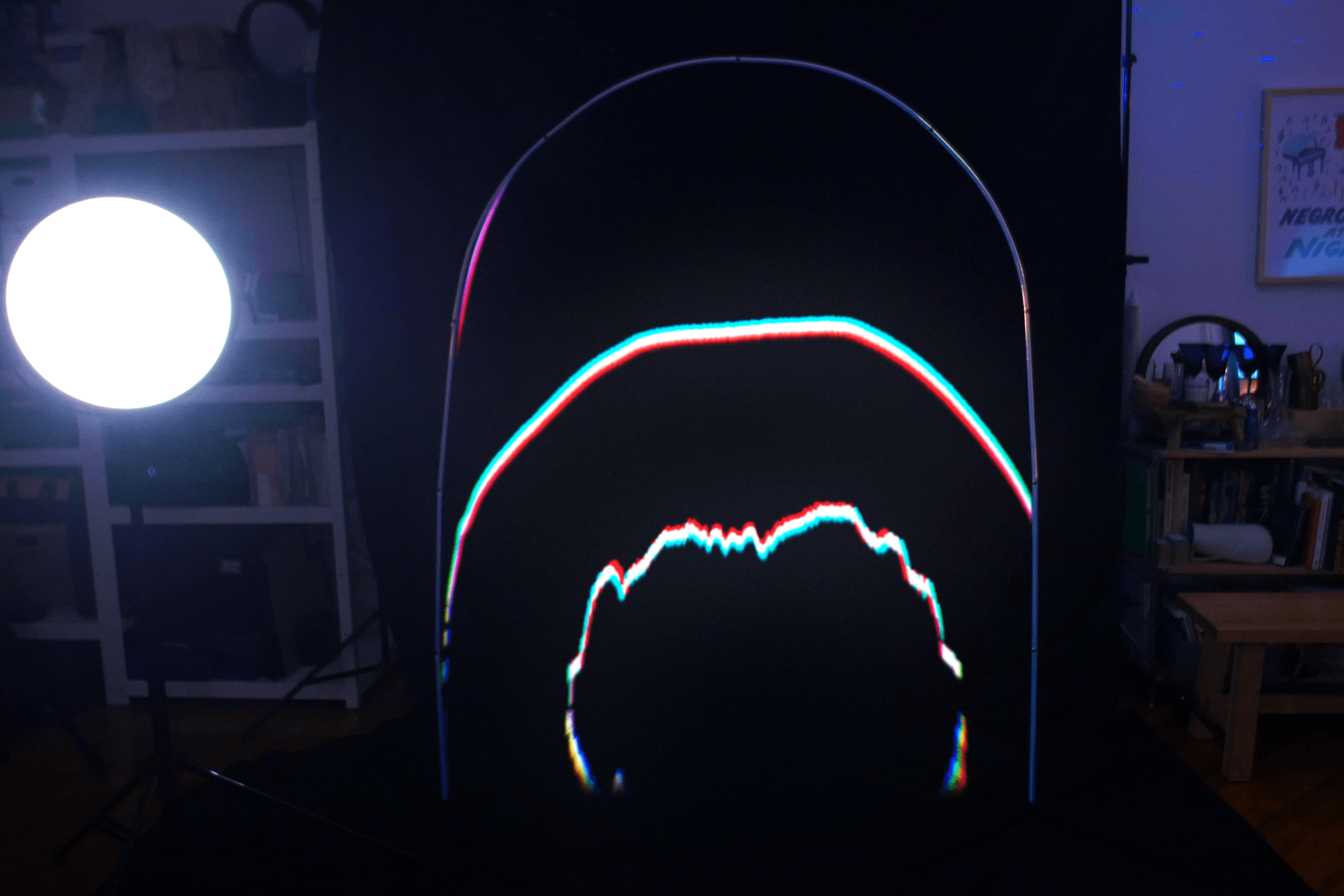
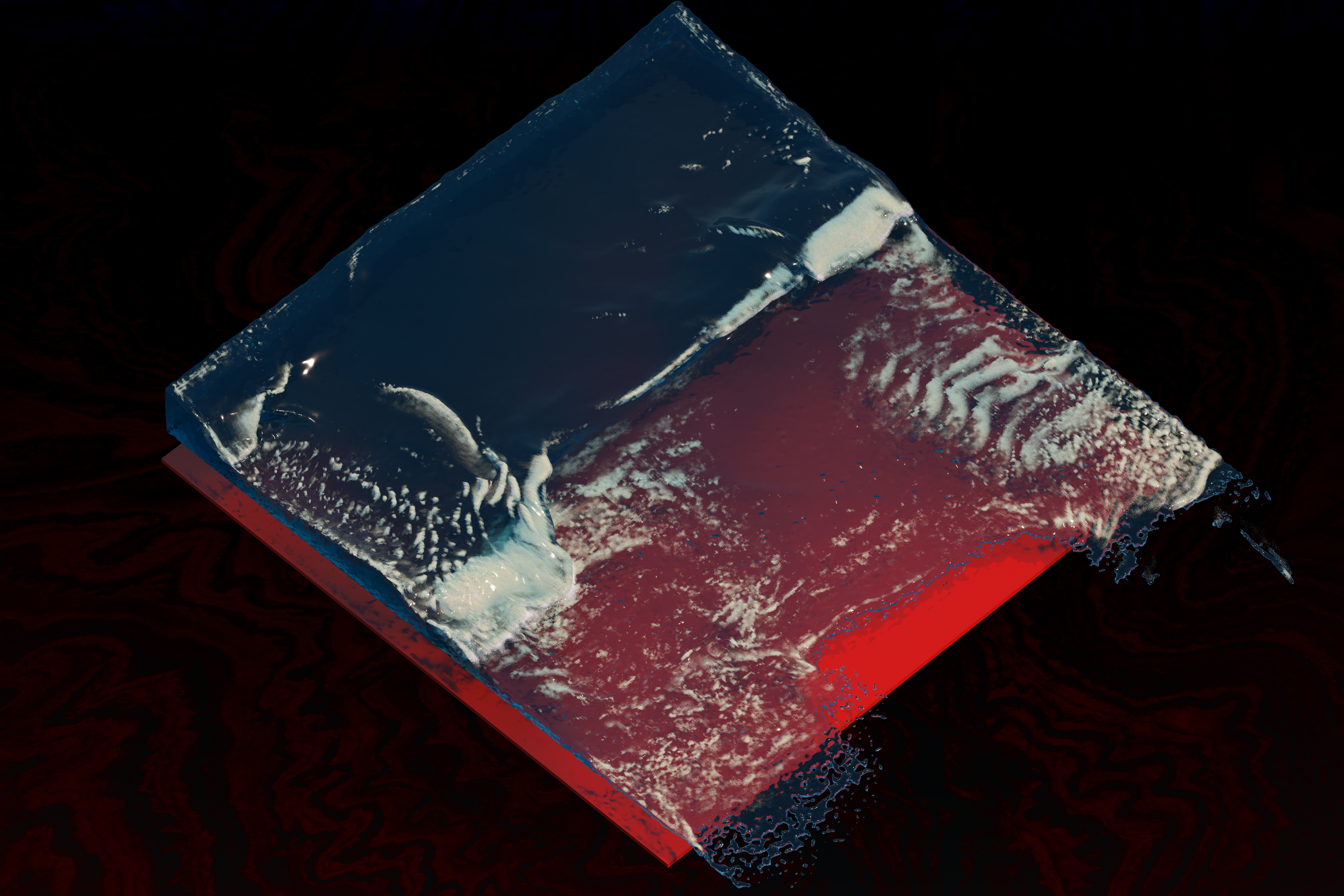
This project was memorable for me in the long, drawn-out exploration process that was ultimately not very successful. I signed onto the project with the understanding that I could "do whatever I want." That's what I thought I wanted, that's the dream! Of course, it is so often just a dream. I had an idea in mind from the beginning that I was pretty excited about. I had some experience creating lenticular prints and I had been thinking about the possibilities of creating a script for lenticular-inspired motion graphics in After Effects. Lenticulars use a rigid piece of clear plastic with many, many bar-shaped lenses on them to create optical effects when affixed onto a properly prepared print. For instance, a 3D dinosaur postcard at the museum, or a "flip" lenticular that flip flops between two images as you walk by it. They're cool, so I spent about a month of my freetime building a lenticular generator in After Effects.
It turns out, this wasn't really working! My client didn't hate it, but didn't love it, and I churned out concepts for a month before we decided to scrap the idea altogether and start fresh. The tipping point for rejecting this design was Chris' own feedback that he wanted something more in the DIY spirit. This was a frustrating experience but also a pretty instructive one. I understood that I had creative freedom, and that there weren't any existing ideas for designs. I perceived this as a positive, but really it wasn't, and it cost me probably 10x the time to finish the project. It was clear, in retrospect, that there wasn't alignment on the direction and I should have insisted on getting direction and collaboration, rather than trying to direct the design myself without any input from Chris. I think I was blinded by the fact that I was doing this in my freetime and I really wanted the opportunity to do "my thing." Whatever I wanted to do, though, it wasn't my project! In the end, I'm happy with the look of the work we did complete and I don't love the lenticular design either. I hope I get to use my generator in a future project, though!
