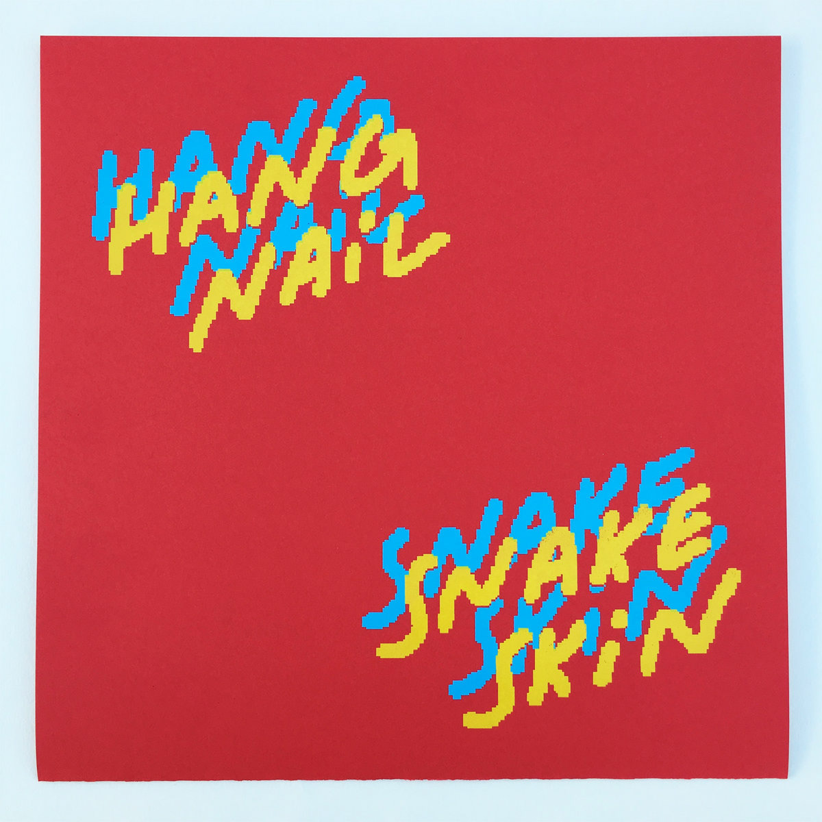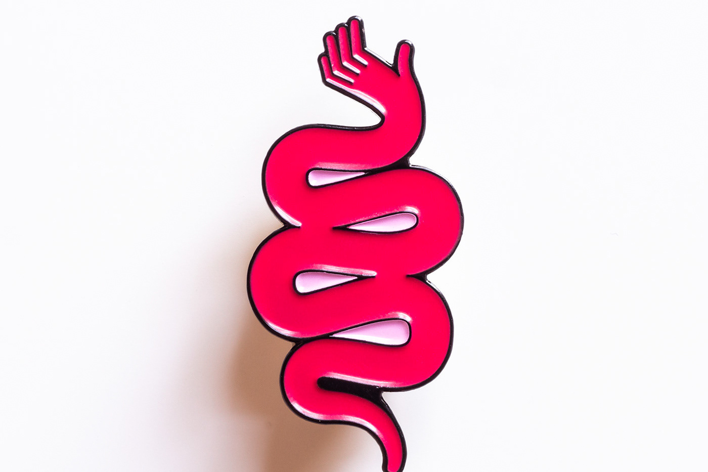
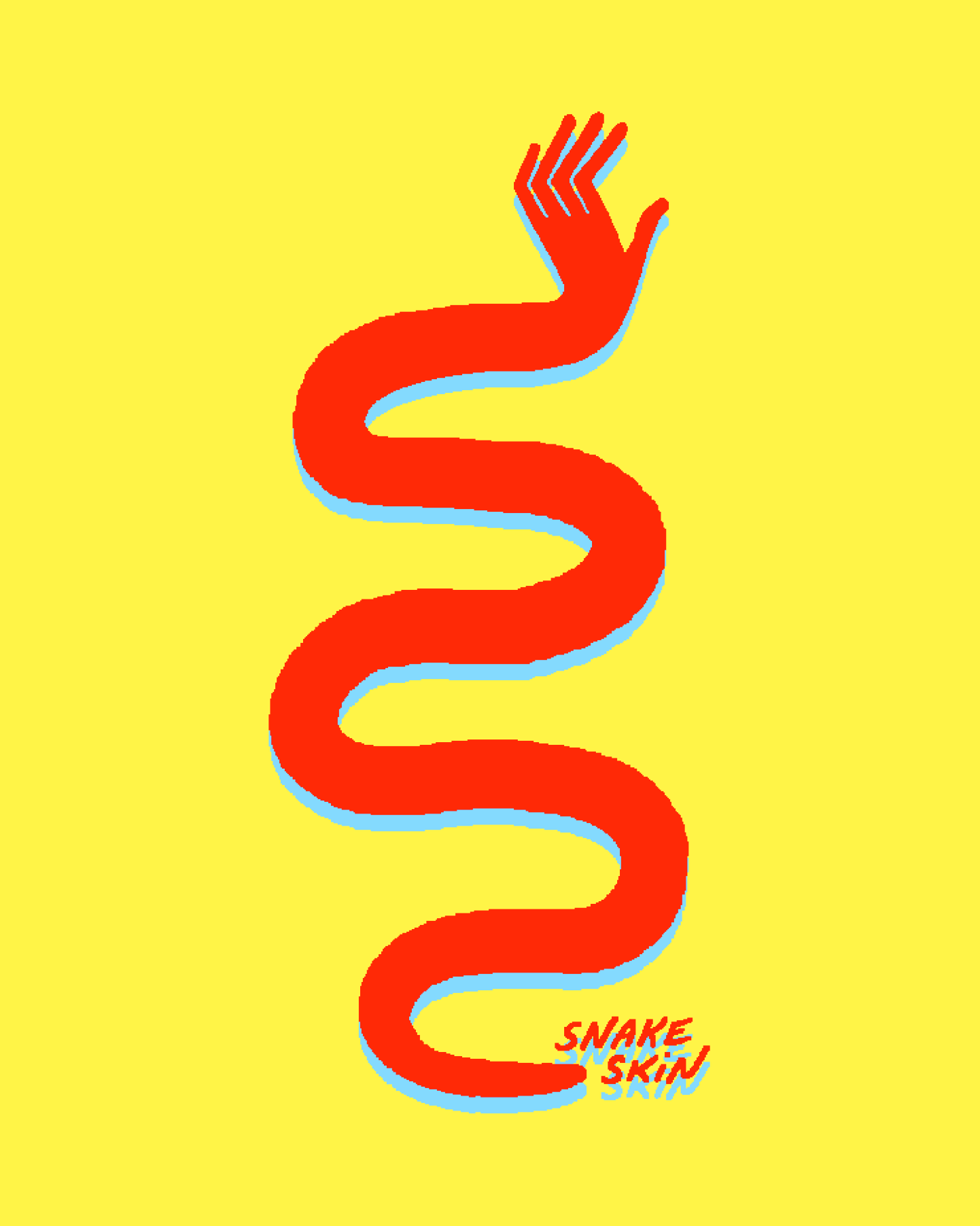
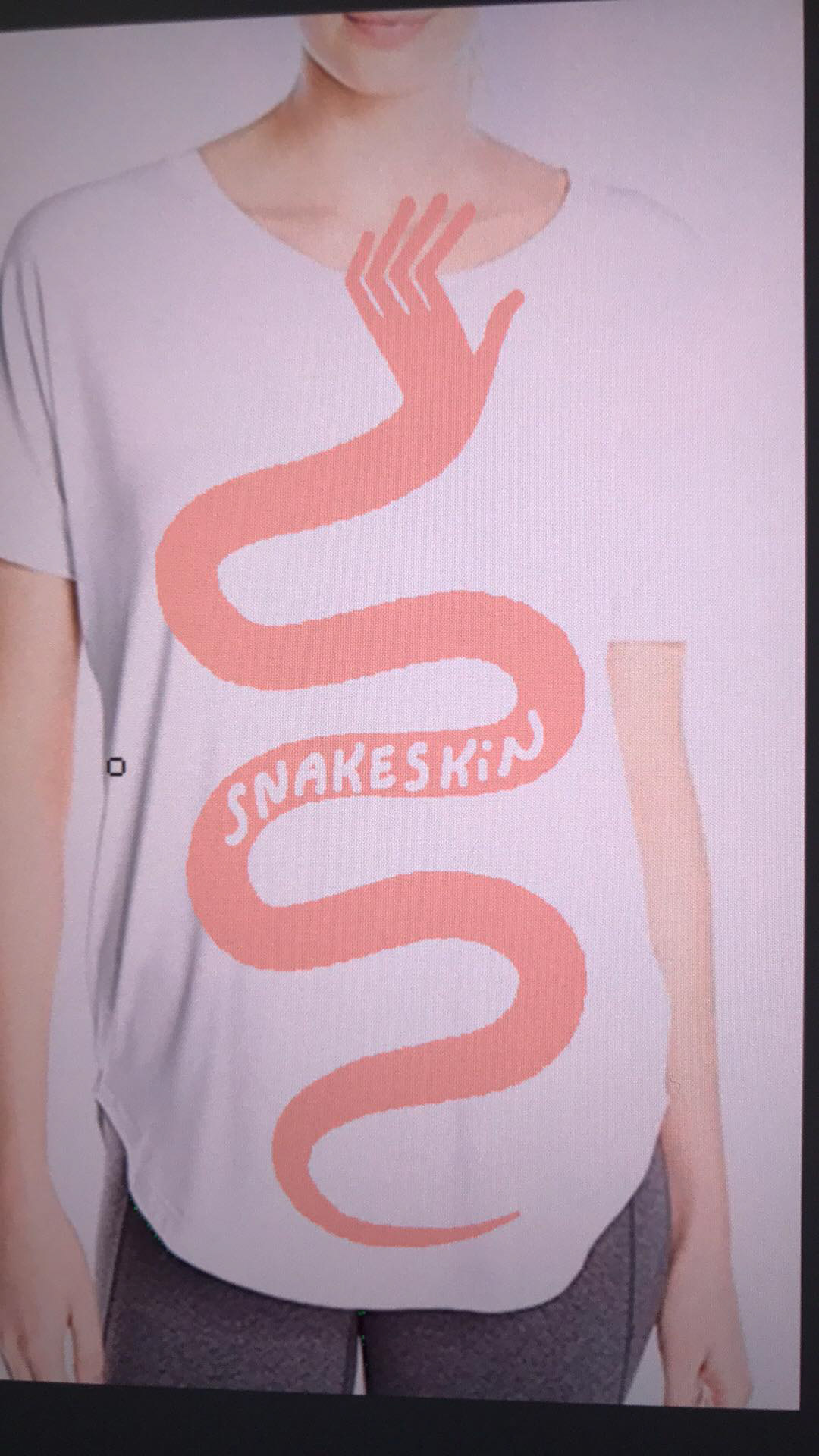
Logo icon design for the punk band Snakeskin. Designed to support their debut LP, HANGNAIL, which was released on February 16, 2018. The icon, a slithering snake with a reaching hand for a head, is simultaneously aggressive, relatable, and funny, much like Snakeskin's brand. In the same way that her music reaches out with its open honesty, the snake hand reaches out.
The aesthetic is strongly graphic - the body taking the form of a single simple paint stroke - and, if you didn't notice, intentionally low-resolution. This lo-fi digital approach echoes the lo-fi screen-printing State Champion Records used to print the artwork, as well as the lo-fi intimate sound of Snakeskin's music; her first EP release with State Champion was recorded entirely in her room.
The colors are my own take on the primary colors, red, yellow, and blue, which are all colors snakes adopt in the wild to signal that they're venomous, and also the loud, aggressive colors of corporate, especially fast-food, identities.
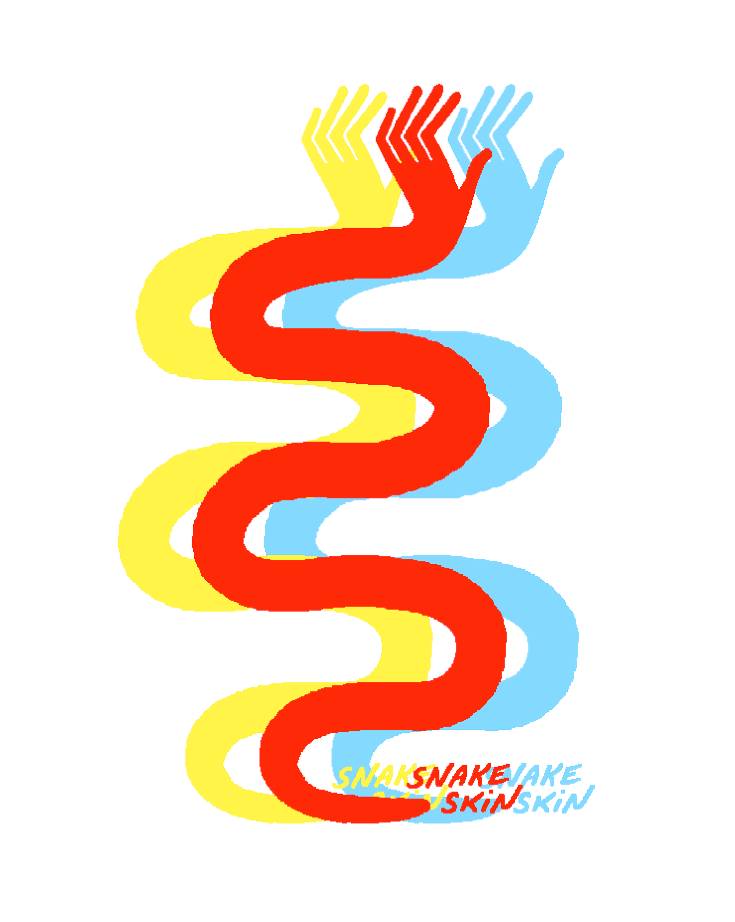
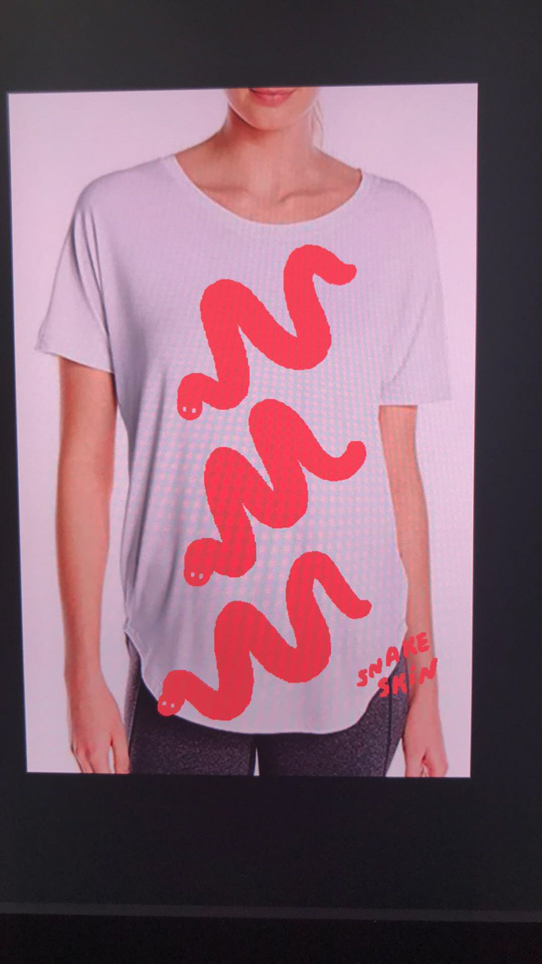
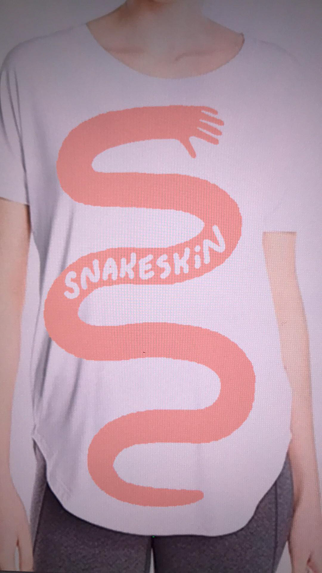
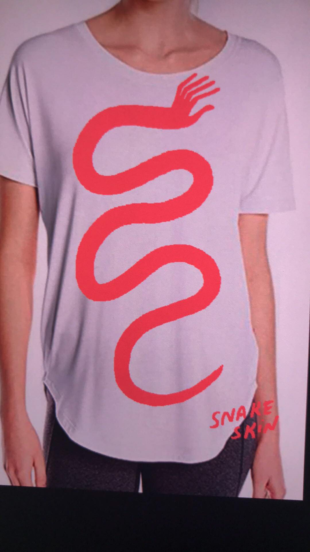
Above: alternate designs for special edition printings.
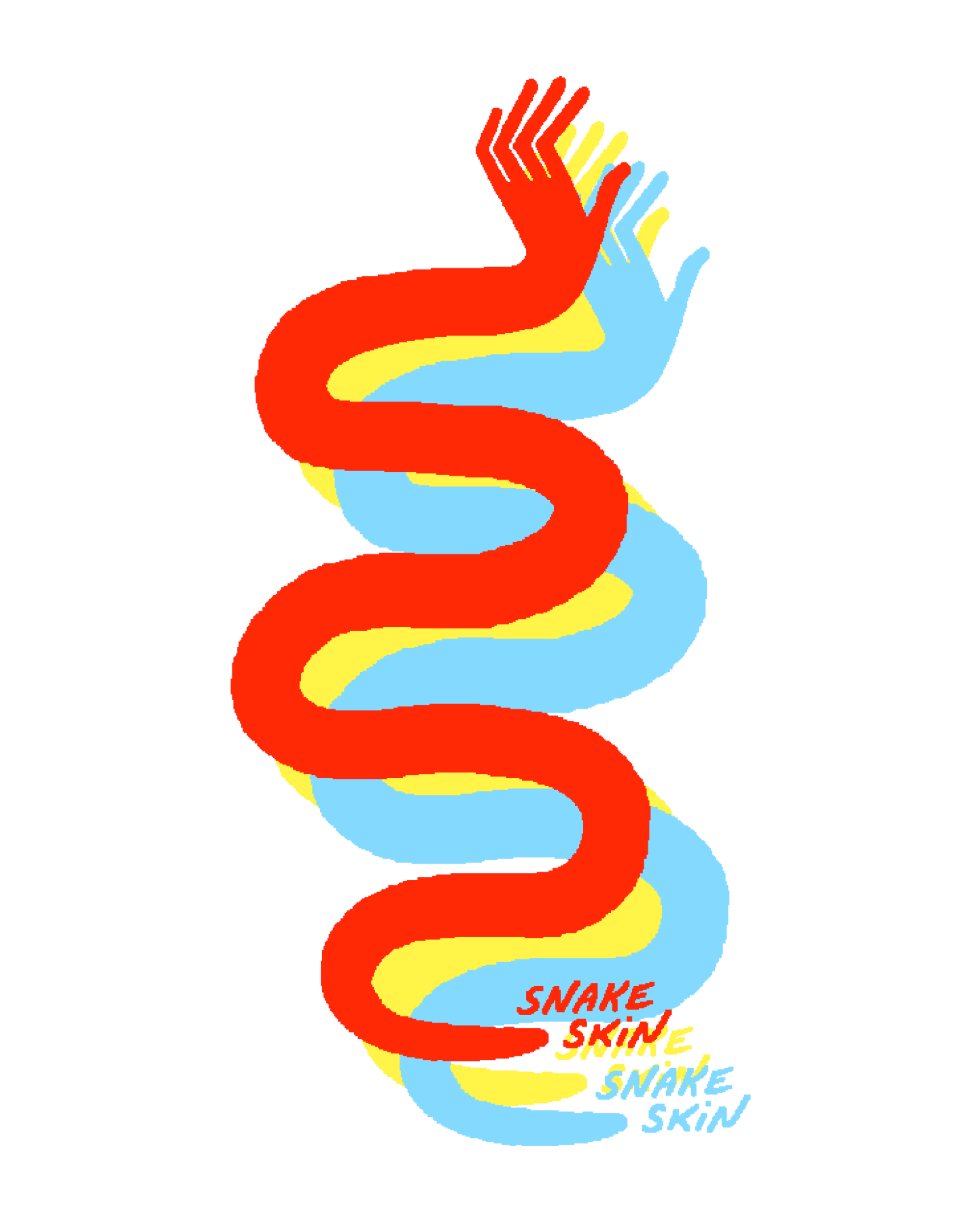
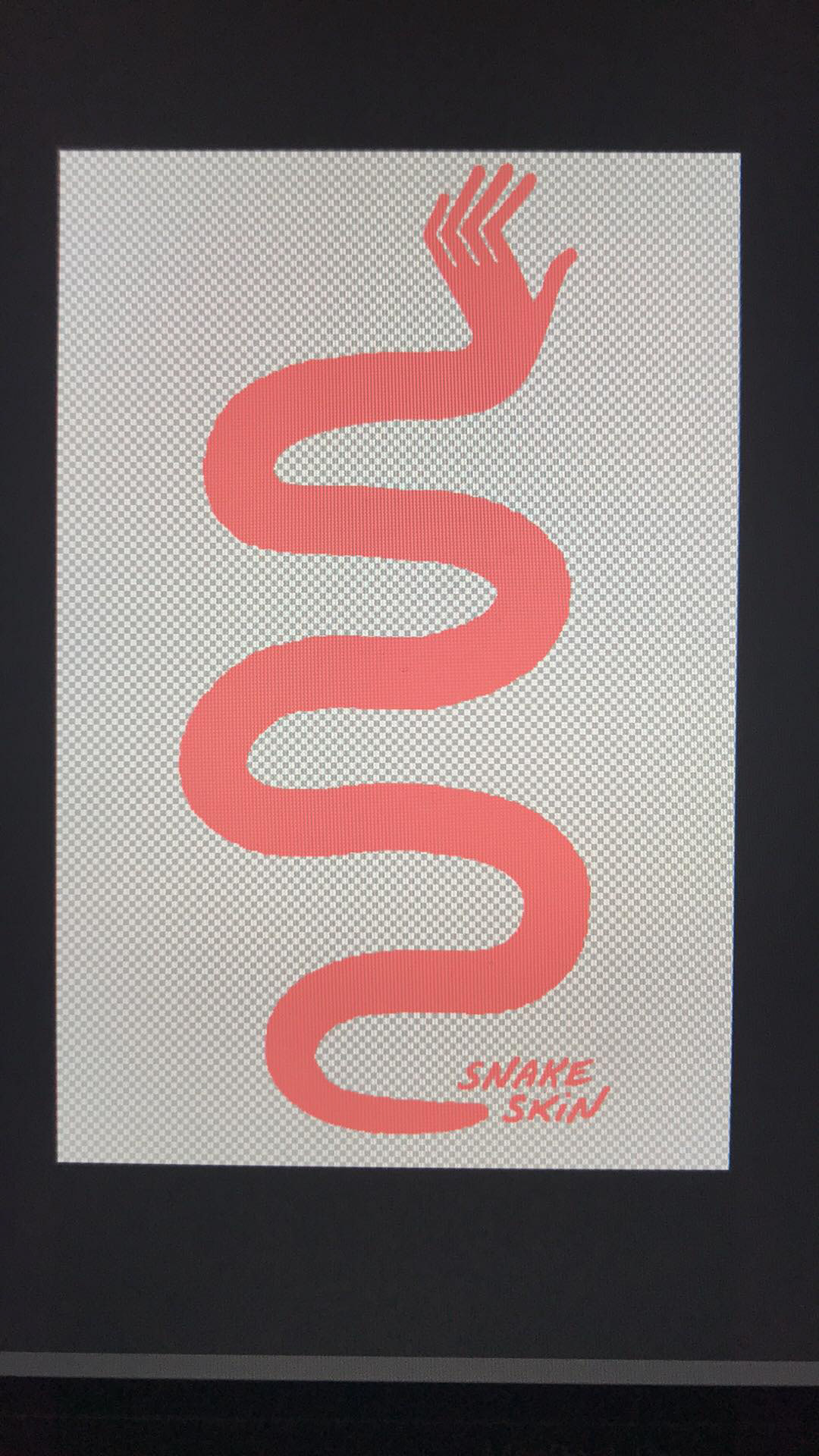
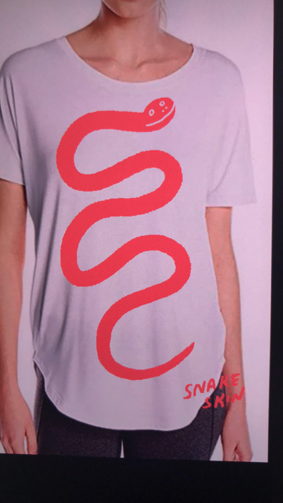
Below: sketches of earlier concepts before the final was selected.
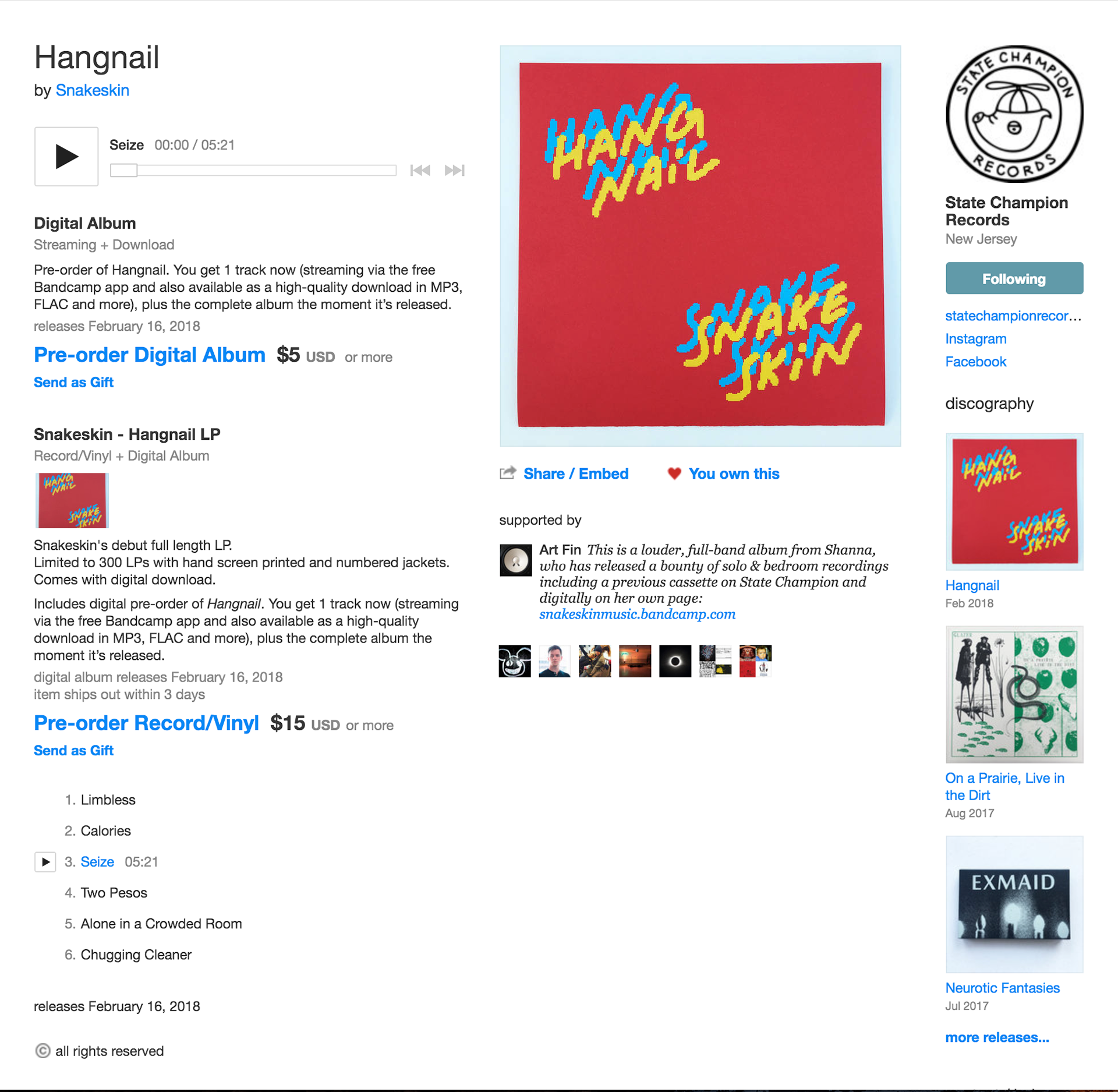
Hangnail is available on bandcamp for purchase digitally or as a limited-edition vinyl pressing.