This is a music video I made in Microsoft PowerPoint for the single "Limbless" off Snakeskin's debut album, HANGNAIL. The seven-minute video consists of hundreds of .GIFs and stock PowerPoint shapes composed together using the built-in animation features of PowerPoint.
The concept behind using PowerPoint to make a music video (which is a bad idea) was that doing something the wrong way may result in a visual, emotional aesthetic that is unique in a crowded creative landscape. Standard creative workflows often result in recognizable and unsurprising work. Conversely, working in ways that are understood as "misuse" of tools or working with "bad" tools can result in unique work. In this project, I was forced to compromise and let the tool do a lot of the decision-making for me, creating a final result that is not solely my vision, but instead the result of the push-and-pull of myself working with/against the tools at hand. From a viewer's perspective, using creative tools like PowerPoint which are ubiquitous but rejected by professionals creates the possibility of surprise and uncanny recognition. Most of the reactions to this video have been, "What??" and "How??" – a welcome response in an age where perfect CGI and digital filmmaking have become boring to audiences.
This has fortunately resulted in the "Limbless" music video being covered by many music news outlets, such as New Noise Magazine, and Impose Magazine. I continue to work in this style as a result of the response and insight I've gained in deciding to insanely create a music video in PowerPoint.
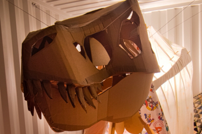
Below are stills and animations I created for the music video with some additional commentary. All images copyright William Bottini 2018.
Above:
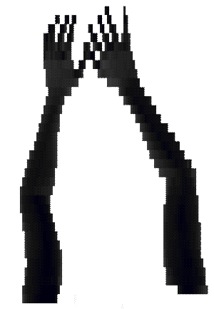
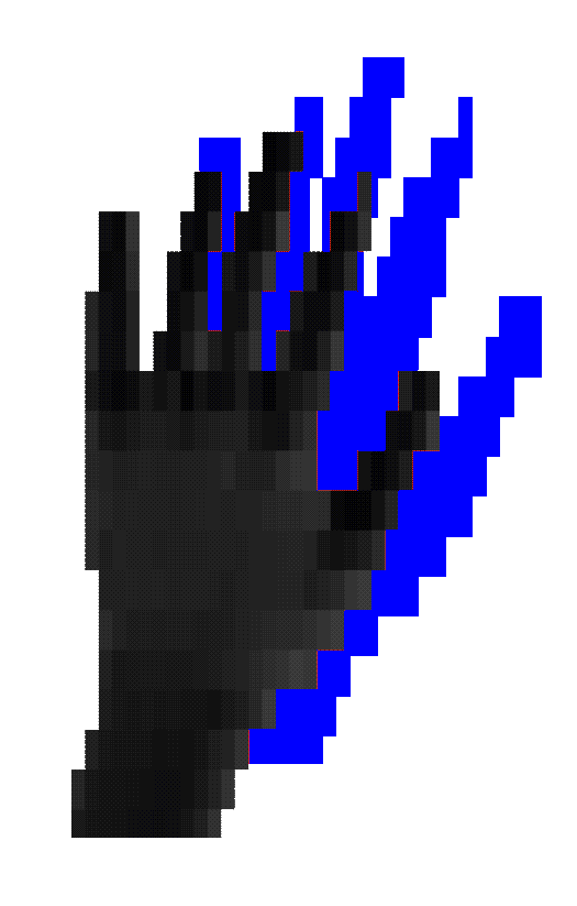
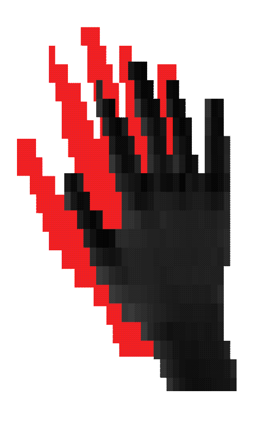
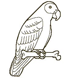
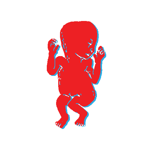
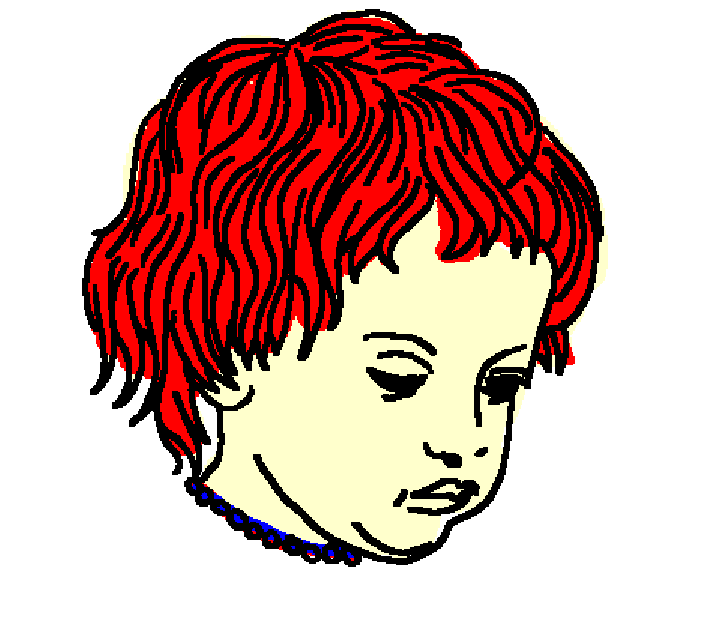
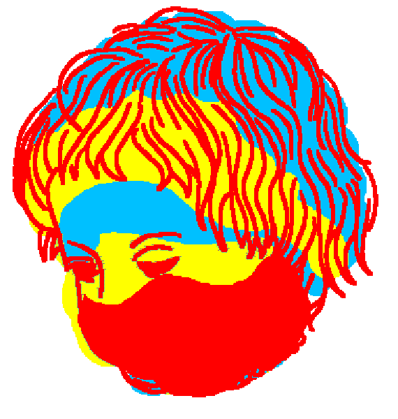
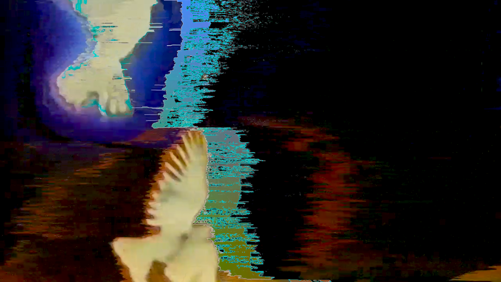
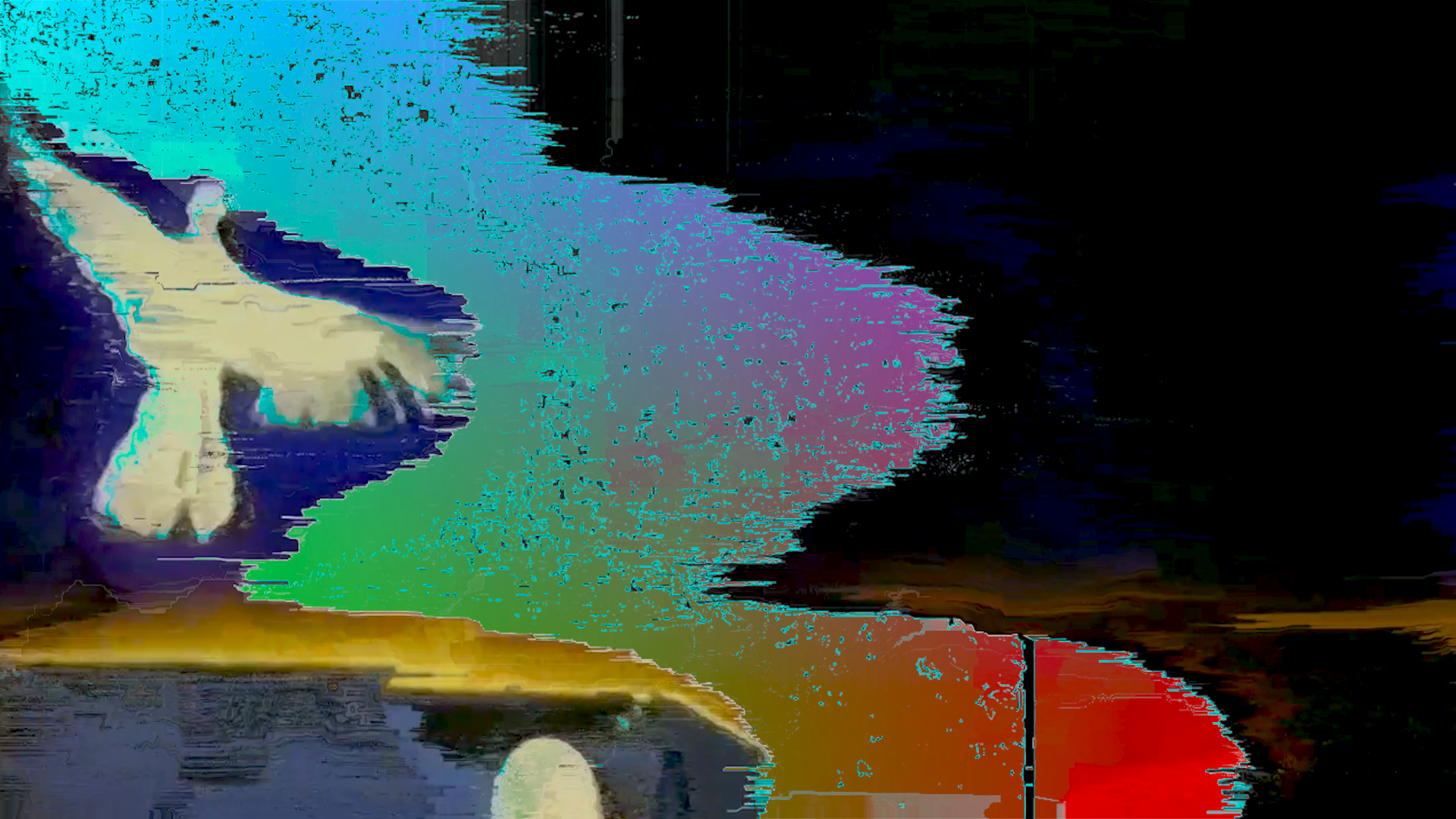
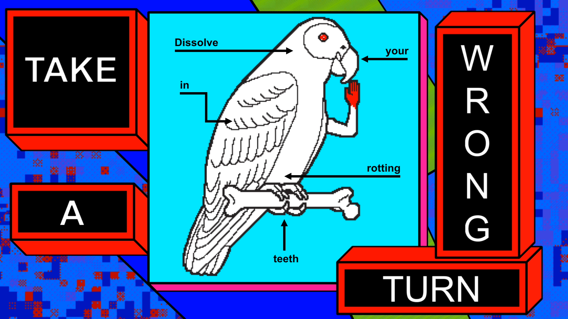
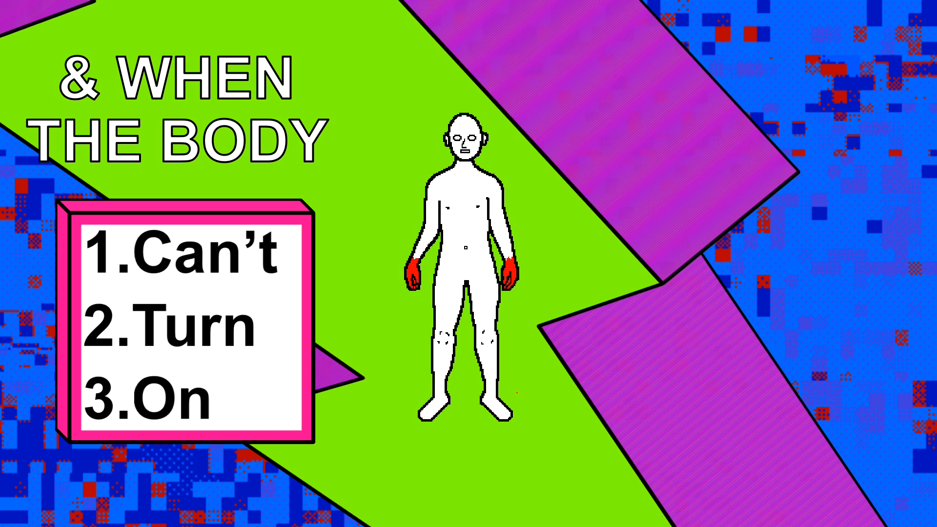
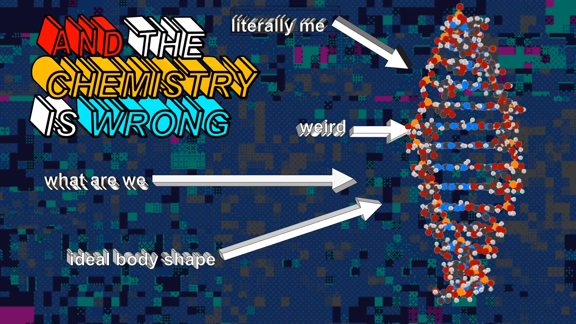
Some animations I created for the music video. The bird was inspired by the 1990s line art of the e-learning site, Enchanted Learning. The fetus design is redrawn and extended on from the 1984 game, Deus Ex Machina.
Below:
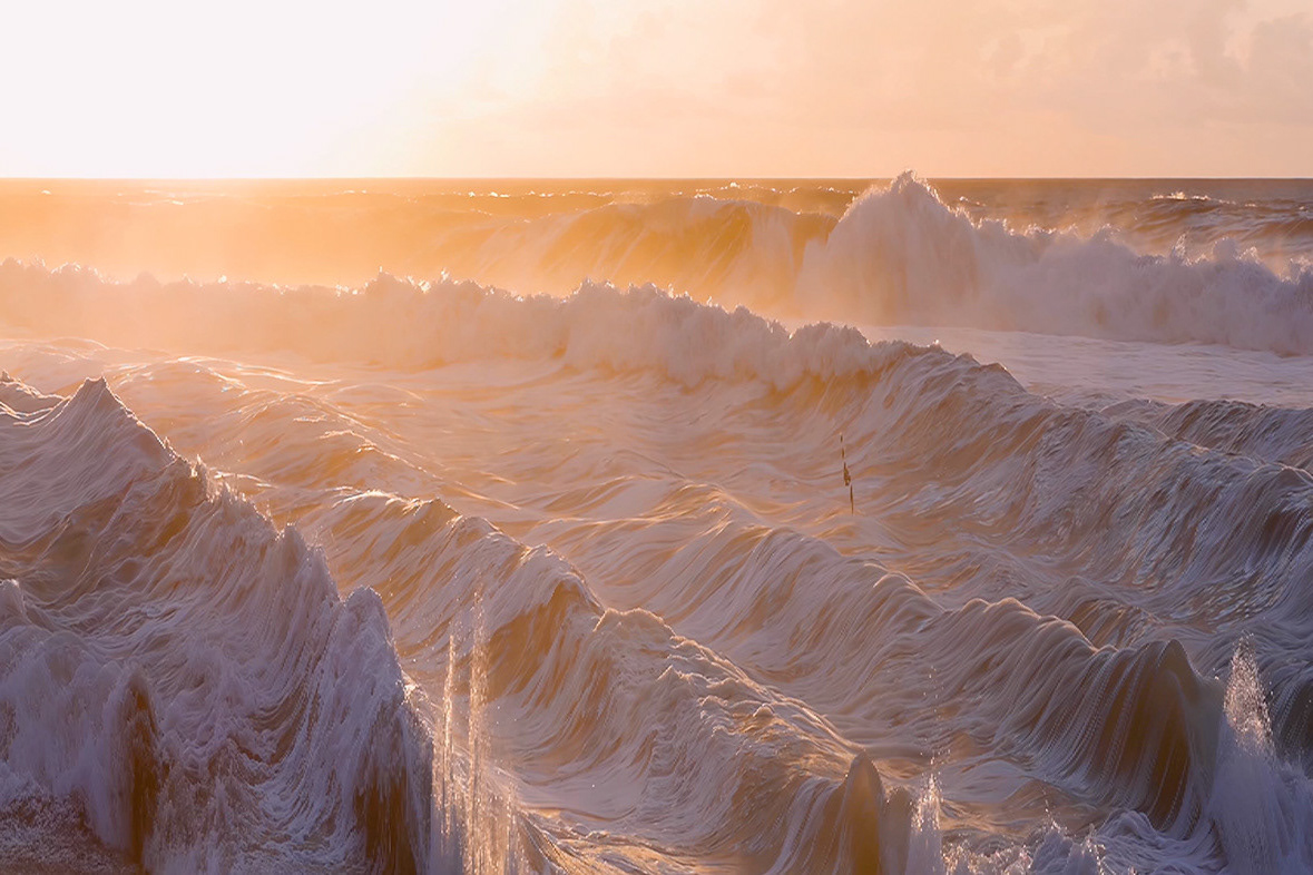
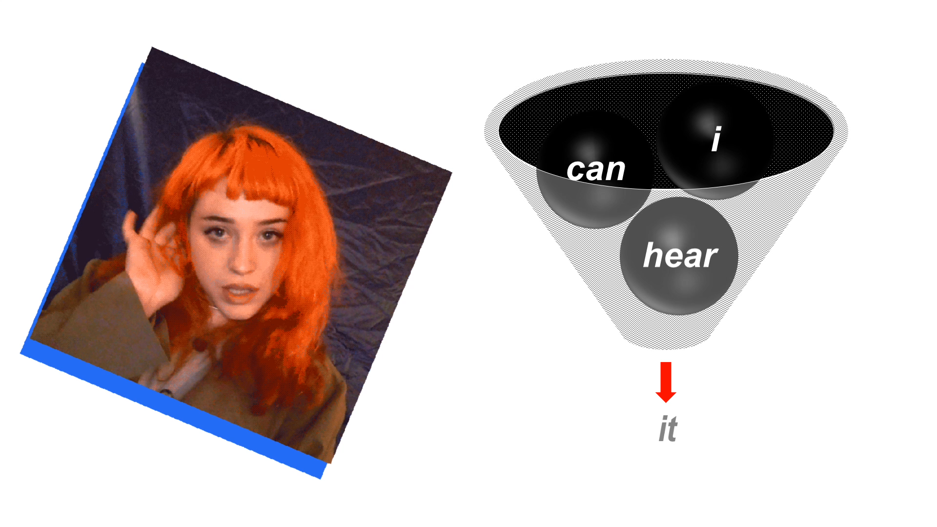
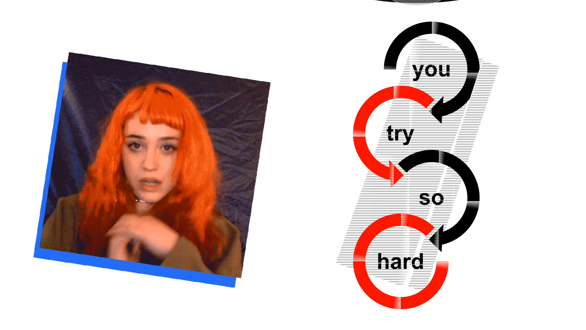
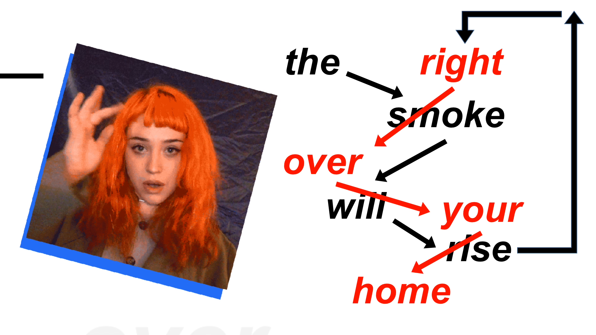
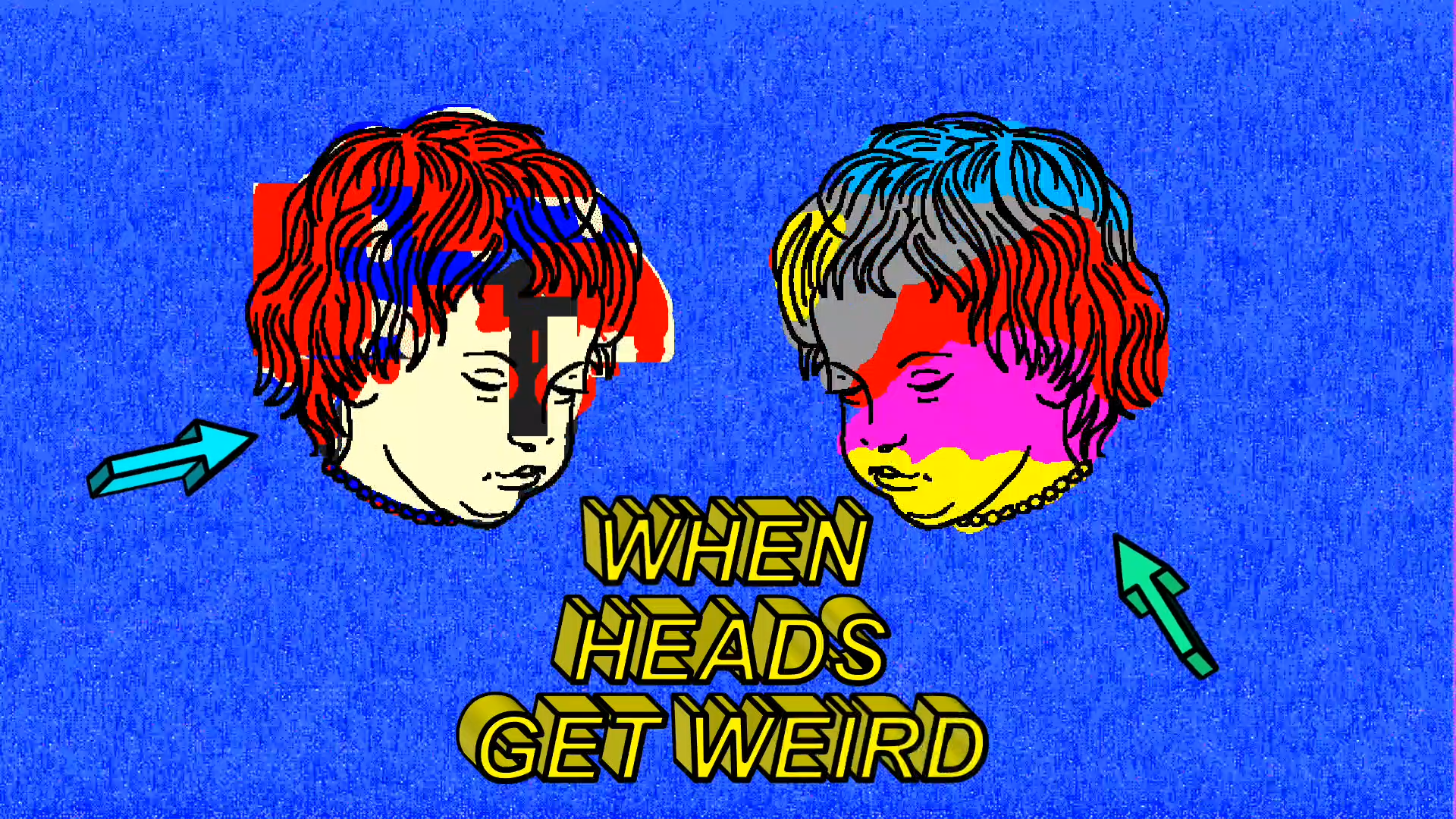
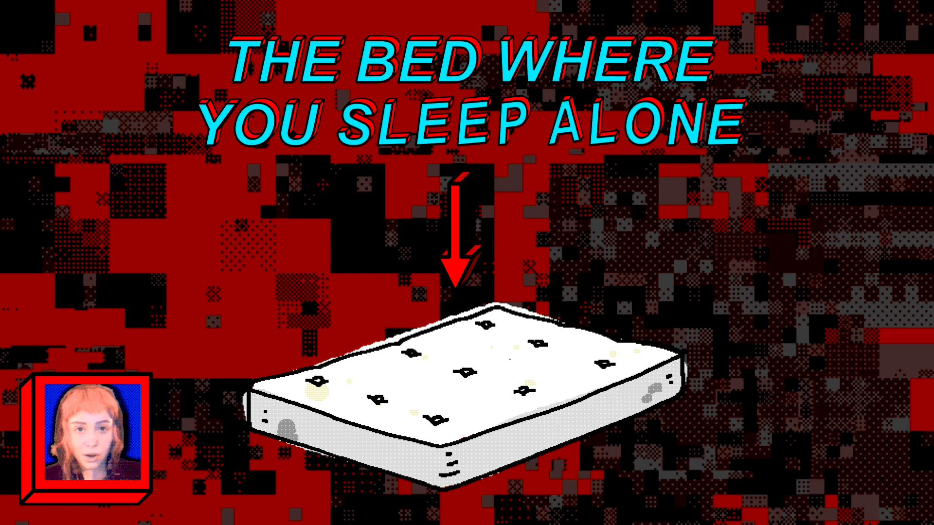
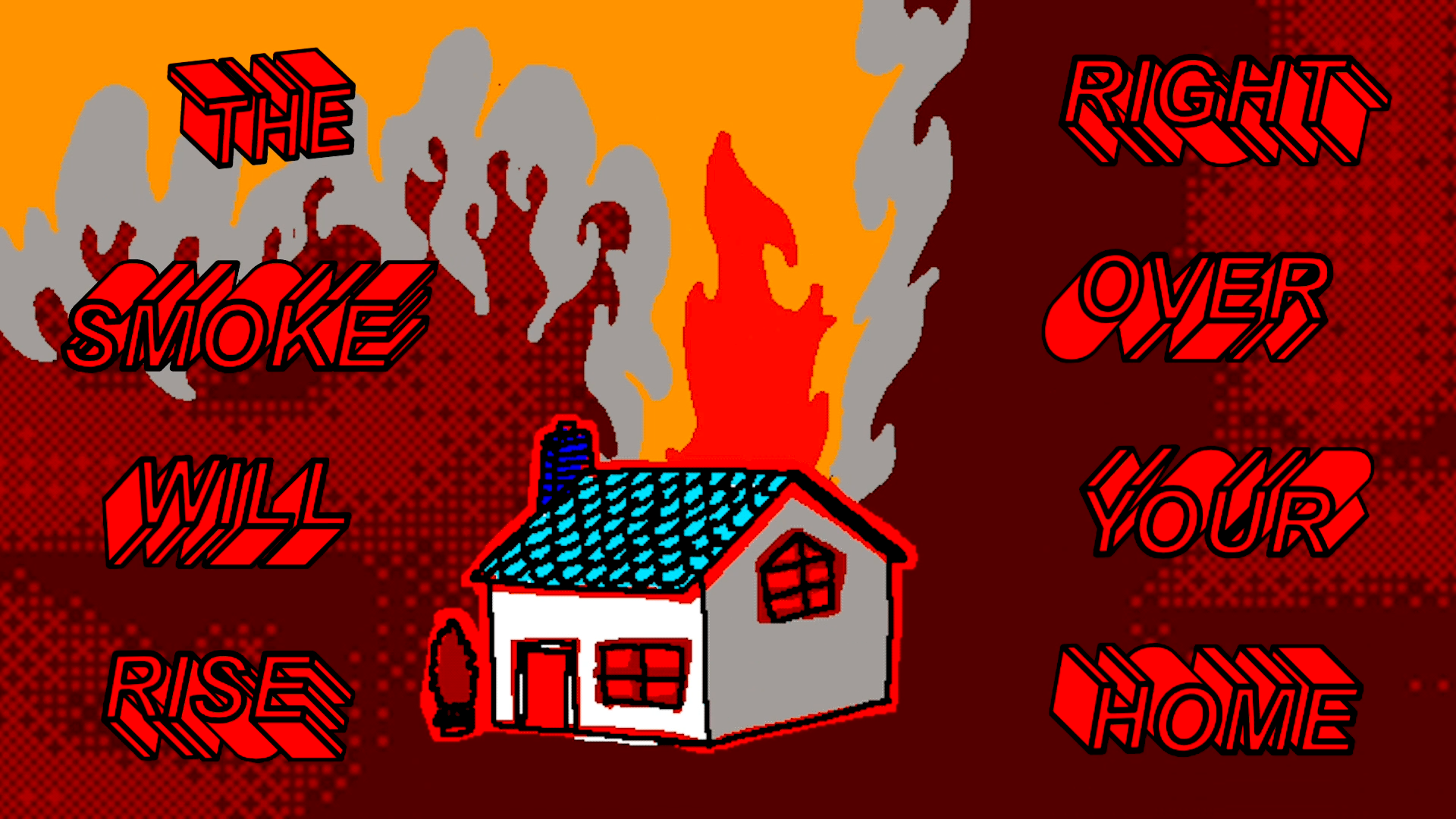
Stills from the video which heavily use the built in shapes and charts in PowerPoint. Some aspects, like the 3D extrusions and default background patterns have become standard aspects of my work.
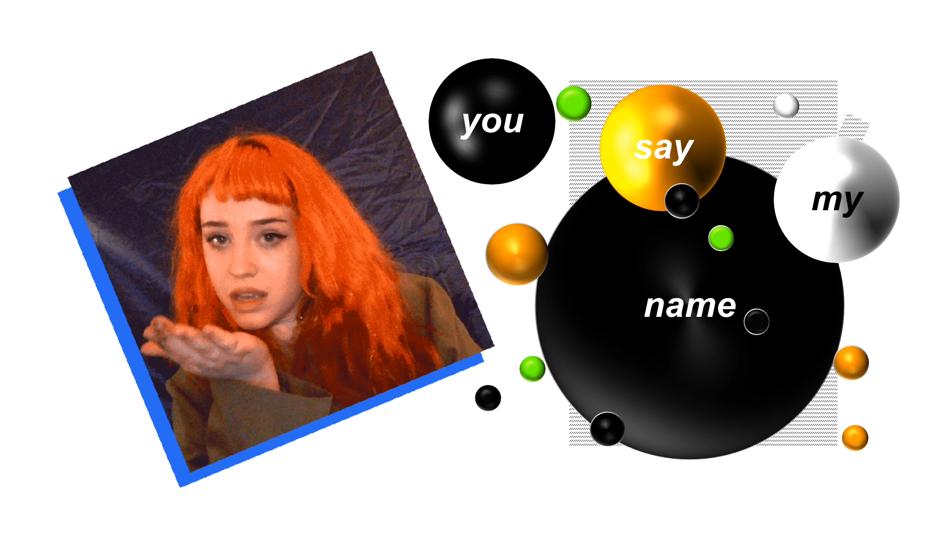
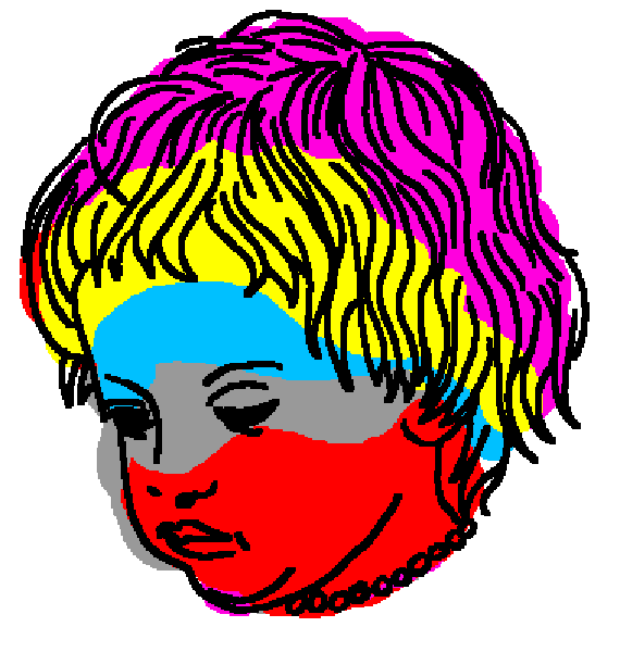
The Default Color Palette:
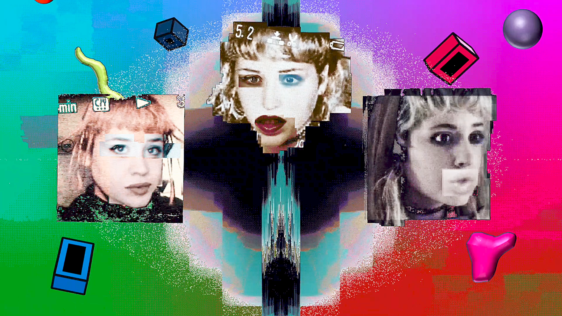
I used the default color palette given to me in PowerPoint in part because some of the animation builds used them, such as the rainbow color transform (below). I decided to stick with this because these basic colors, far from being a non-choice, actually gave the video a familiarity that worked with the idea of using PowerPoint. I am not trying to hide the fact that PowerPoint is used in this project, I am wholly embracing it.
Below:
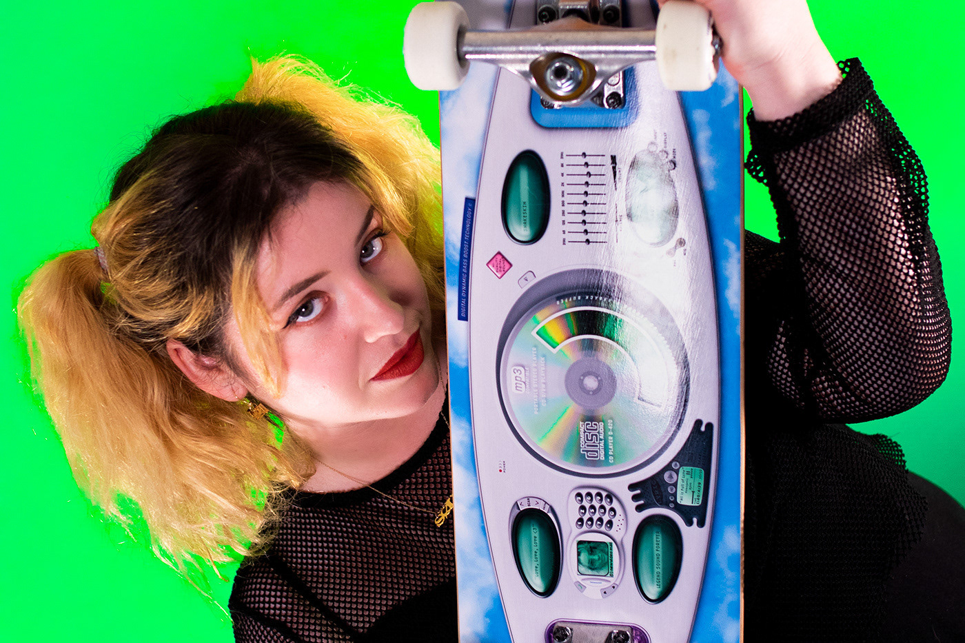
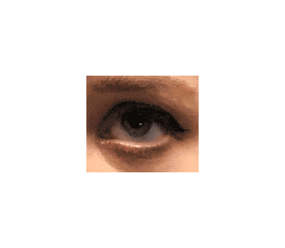
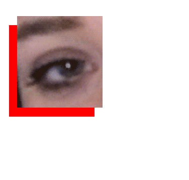
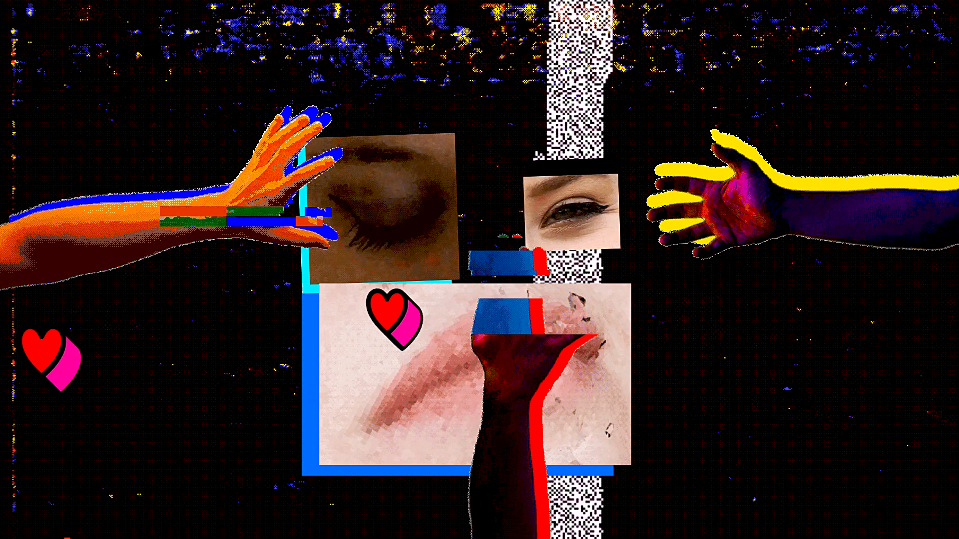
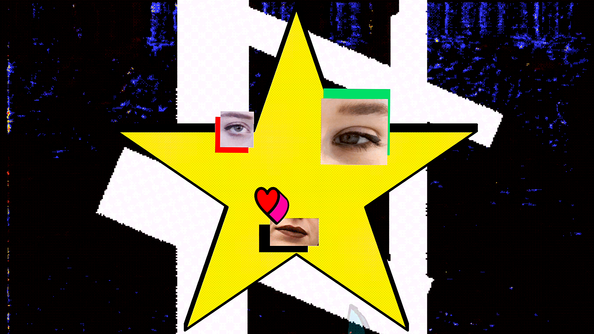
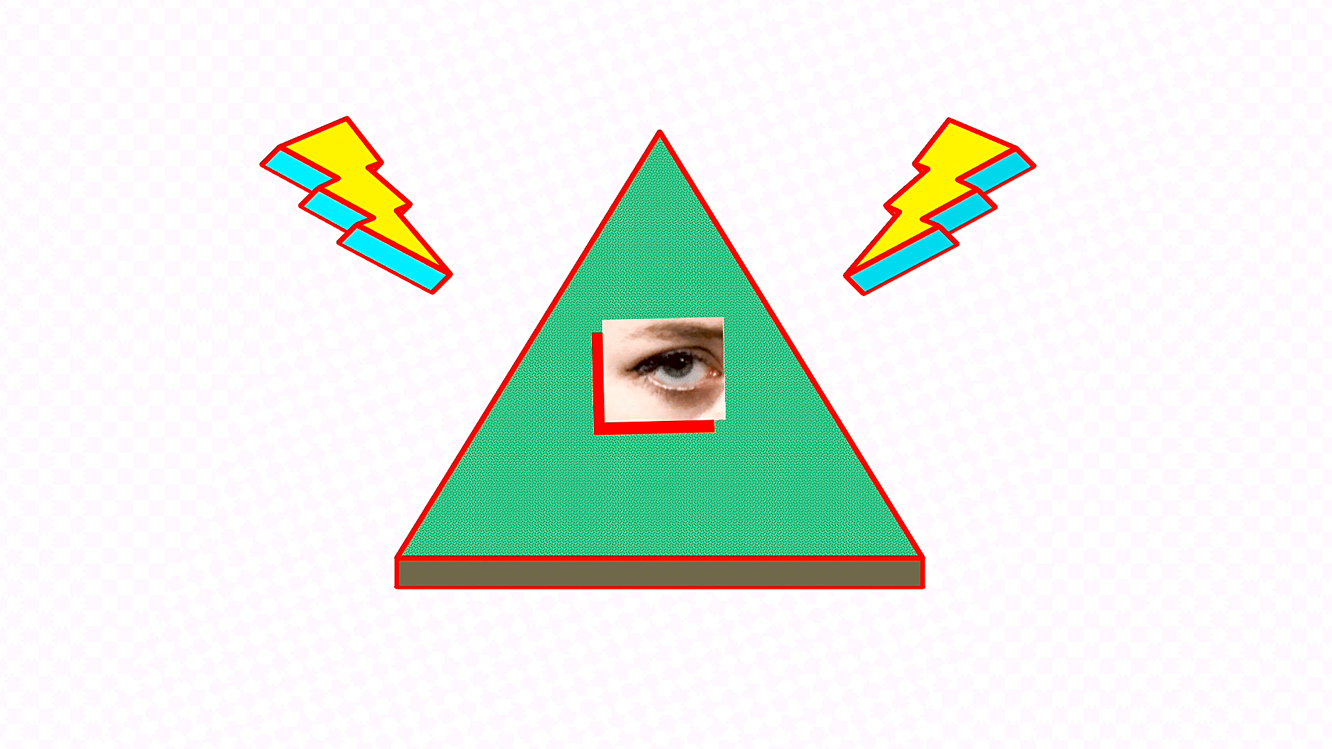
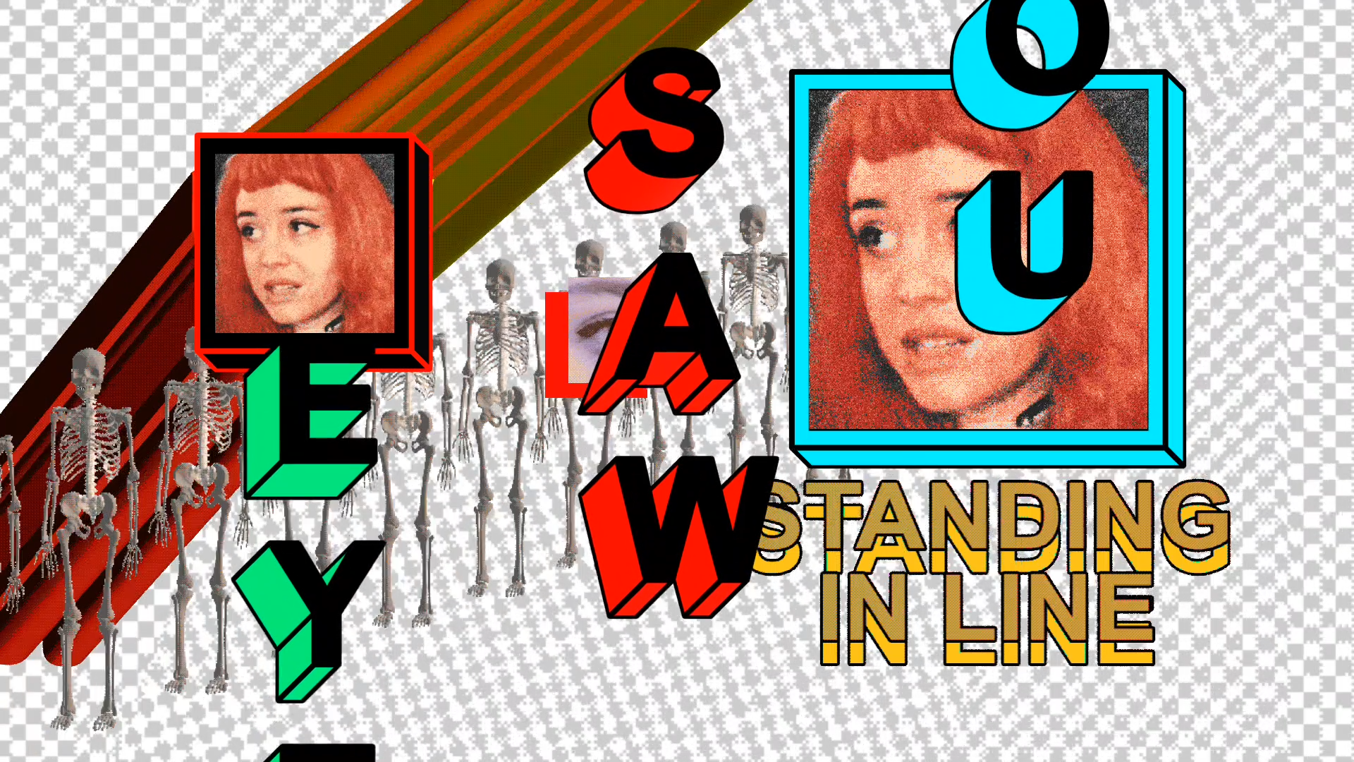
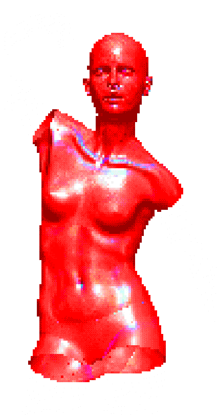
Working fast meant incorporating found images of Snake, including collages of her eyes and face which I animated using Adobe Character Animator into Frankenstein-like digital avatars. Combined with the 3D shapes I made in PowerPoint and other animations I made, they form an intimate handmade digital aesthetic.

Below:
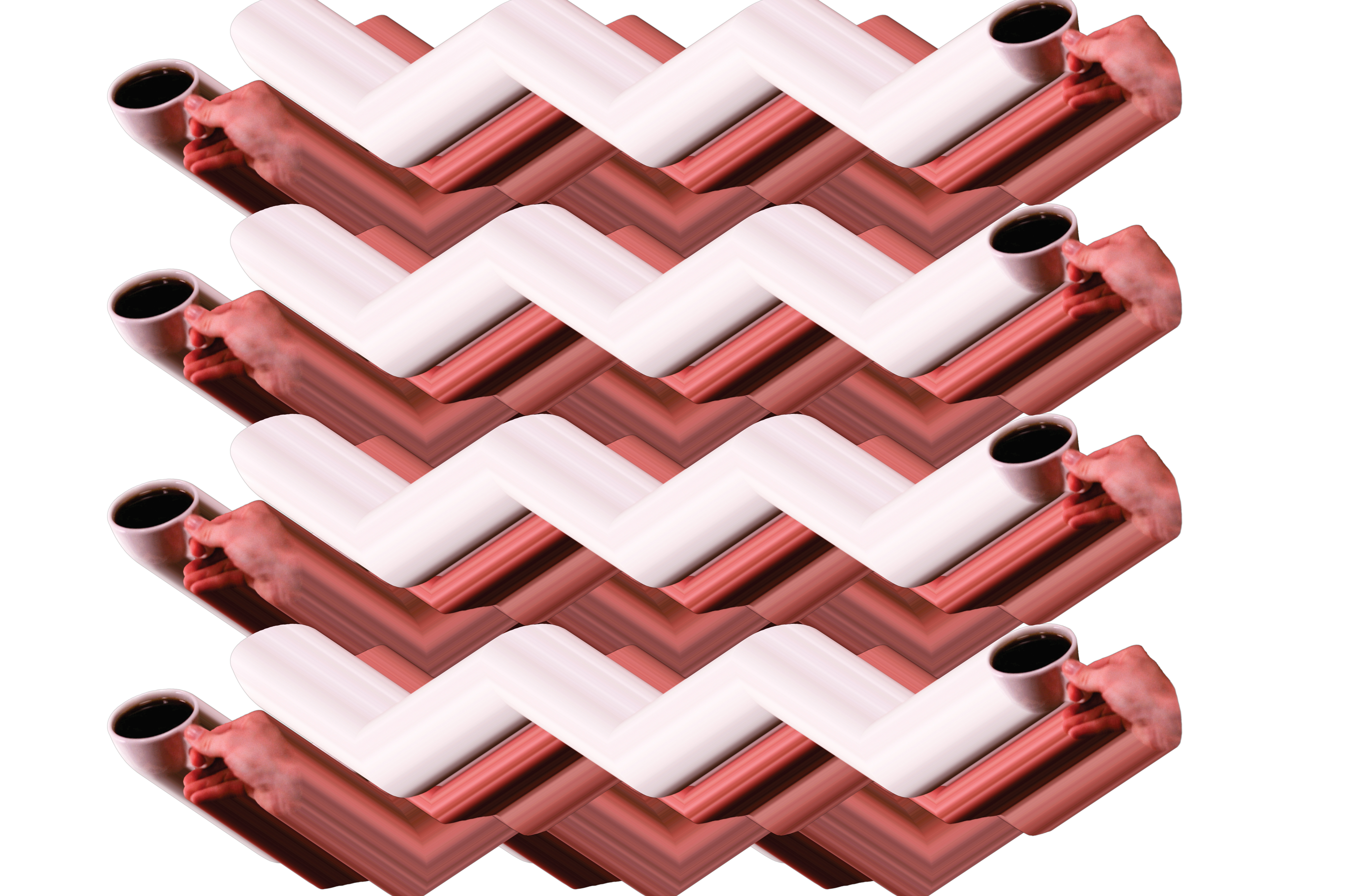
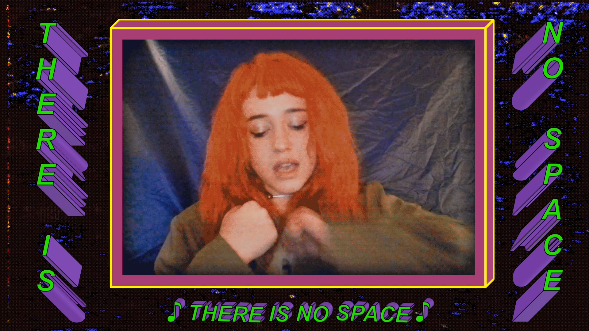
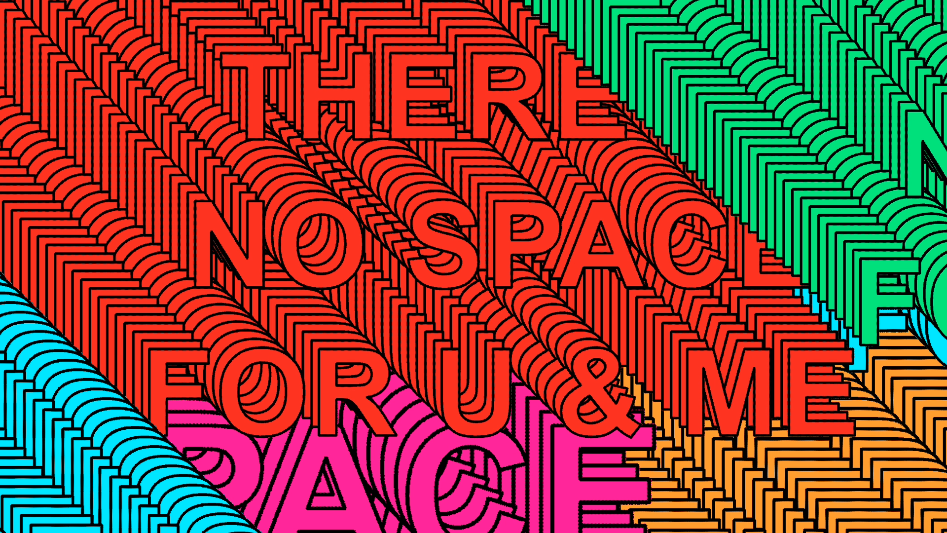
The "There is No Space" sequence in the video features duplicating word art which seems to extrude from off the screen. This art style may remind you of Tyler Spangler, who has gained notoriety for this style. In truth, the style is actually the result of using PowerPoint's duplicate function, which copies and pastes an asset 10 pixels right and down from the original. Doing this enough times creates these extrusions.
Animation Builds:
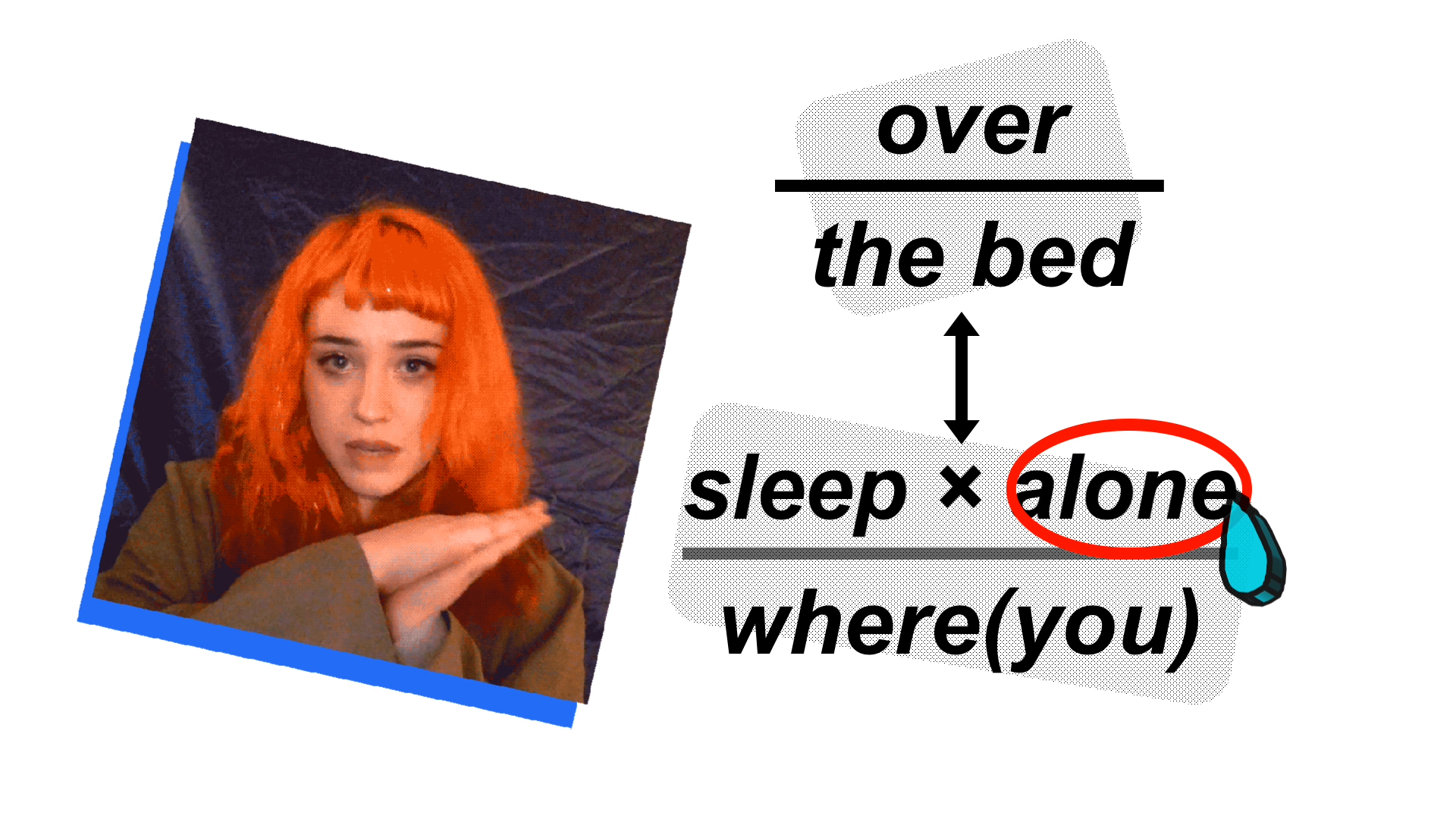
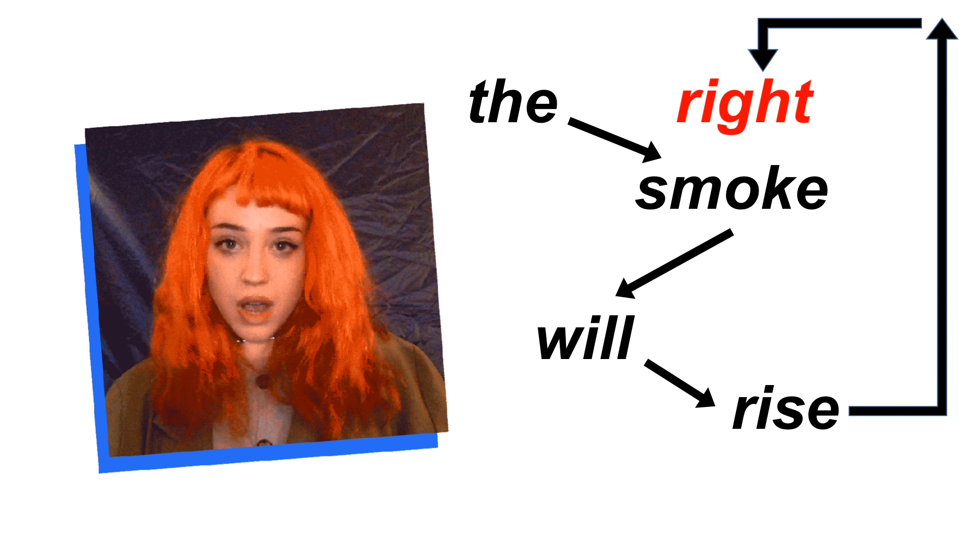
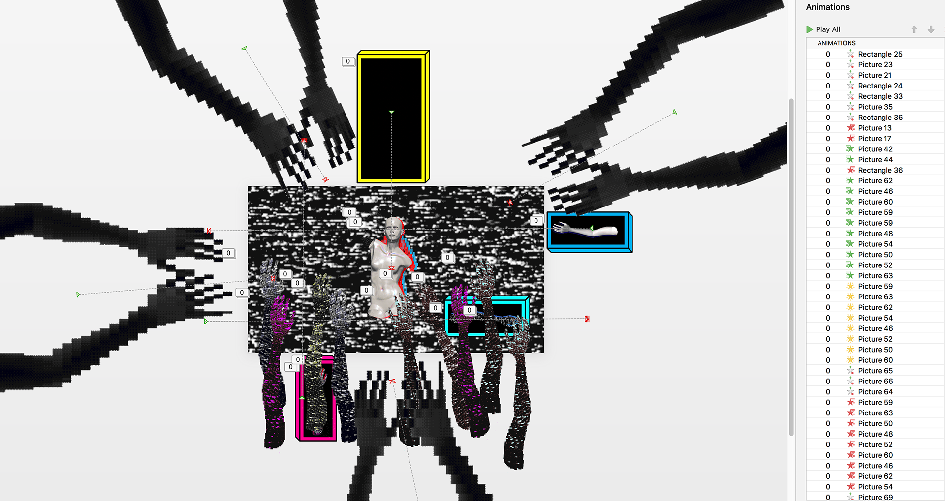
Much of the video takes the form of a "lyric video." These parts of the PowerPoint are timed using the Animation Build features, which are timed by the millisecond (see below). Much of the time spent making this video involved rendering and re-rendering the video to adjust these millisecond timing intervals. I eventually created a spreadsheet of timing cues to use to time everything together.
Embracing Bad Tools:
Using PowerPoint to the level I did was only possible because I also used conventional creative software to create the artwork. So, can I really say I made this in PowerPoint? I think so, in part because my use of these other tools was fully dictated by PowerPoint's constraints. I created, for example, low-resolution 3D animation .GIFs which would only playback in PowerPoint if they were highly compressed loops. If I was to finish this project on time, I had to admit that PowerPoint was going to define my aesthetic choices for me: a pixelated look with a low number of colors, a reliance on looping animation aided by the built-in animations of PowerPoint, and so on.
The end result is a video with a unique aesthetic that surprised its viewers and taught me a lot. By embracing the constraints of a flawed tool, or by intentionally misusing a tool, creative choices emerge from the process. If you choose to fight against these constraints, you may miss the ideas which emerge from working with these constraints. In my case, I found a lot of joy in surrendering to the tool and letting PowerPoint teach me, ironically, a new direction in visual design.